Distritution Plots
Distribution plots are useful if providing a visual representation about the characteristics of our sample. We can easily gauge the central tendency - mean, mode and median- and the spread of our sample by looking at distribution plots. In this notebook, we will use histograms and kernel density plots to visualize the distribution of data.
import numpy as np
import matplotlib.pyplot as plt

%matplotlib inline
Generating random numbers from a normal distribution with a mean of 30 and a standard deviation of 5
np.random.seed(43)

x_sample = np.random.normal(30,5, 200)
x_sampleHistogram with Matplotlib
Matplotlib provides a convenient plotting function to render a histogram given an input vector. We can also specify the binning as we see fit. Note that binning can influence your reading of the nature of the distribution.
plt.figure(figsize=(9,6))
_ = plt.hist(x_sample, ec='black', bins=15)
plt.title('Histogram of X-Sample')
plt.xlabel('X-Bins')
plt.ylabel('X-Counts')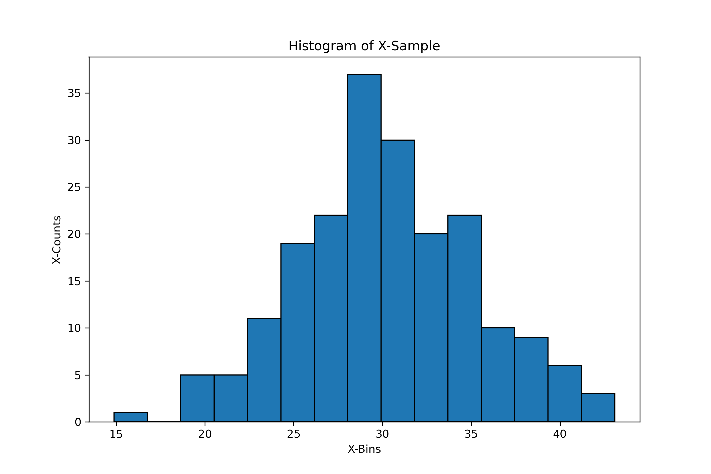
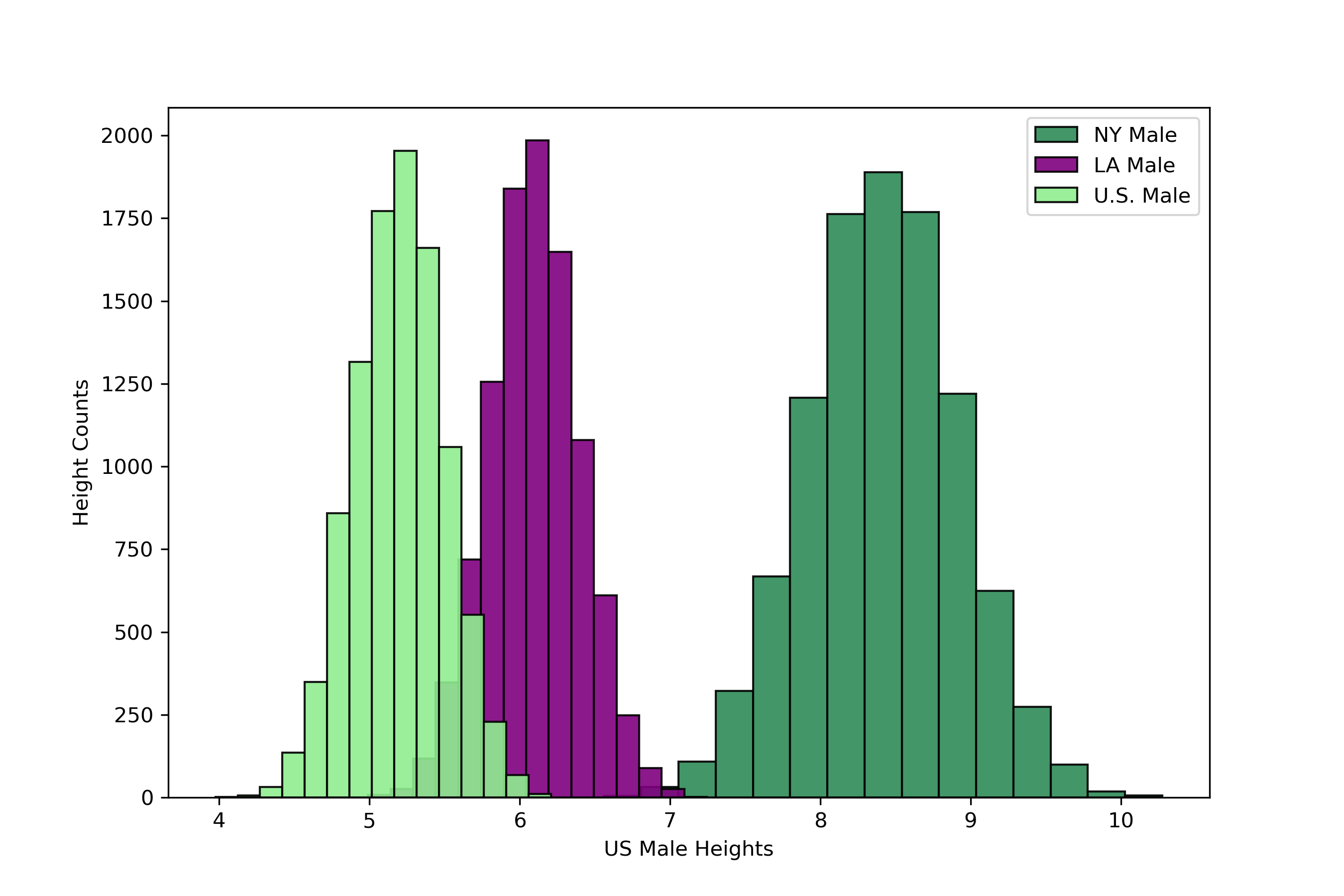
Comparing Multiple Histograms
We can also compare histograms within the same canvas. For example, let's suppose that we want to compare the height of U.S. male from NY, LA against of U.S. For simplicity, let's assume the heights are normally distributed. Let's simulate these vectors with difference central tendencies
ny_heights = np.random.normal(8.4, .5, 10000)
la_heights = np.random.normal(6.1, .3, 10000)
us_heights = np.random.normal(5.2, .3, 10000)
plt.figure(figsize=(9,6))
plt.hist(ny_heights, edgecolor='black', bins=15, color='seagreen', label='NY Male', alpha=.9)
plt.hist(la_heights, edgecolor='black', bins=15, color='purple', label='LA Male', alpha=.9)
plt.hist(us_heights, edgecolor='black', bins=15, color='lightgreen', label='U.S. Male', alpha=.9)
plt.xlabel('US Male Heights')
plt.ylabel('Height Counts')
plt.legend()