Bar Plots
Bar plots are useful in representing categorical information. Bar plots visualize the values associated with categories as separated rectangular.
Let's see an example in python
import numpy as np
import pandas as pd
import matplotlib.pyplot as plt

%matplotlib inline
%config InlineBackend.figure_format = 'retina'
Let's initialize a dataframe with some data about soccer players and their goal scoring in the group stages of the world cup. This data is fictitious.
sample_data = pd.DataFrame({'Player': ['Ronaldo', 'Kane', 'Messi', 'Neymar', 'Lukaku'],
                            'Game 1': [2, 3, 1, 1, 2],
                            'Game 2': [1, 1, 2, 0, 3],
                            'Game 3': [3, 2, 4, 1, 2]})
sample_data.set_index('Player', inplace=True)
sample_data| Game 1 | Game 2 | Game 3 | |
|---|---|---|---|
| Ronaldo | 2 | 1 | 3 |
| Kane | 3 | 1 | 2 |
| Messi | 1 | 2 | 4 |
| Neymar | 1 | 0 | 1 |
| Lukaku | 2 | 3 | 2 |
Simple Bar Plot
With the data above we can build a simple bar plot to represent the goals scored in the first match. Notice that the index of the dataframe is used as the x-axis labels
_ = sample_data[['Game 1']].plot(kind='bar', figsize=(10,5))
plt.title('World Cup 2018 Game 1 Scores')
plt.ylabel('Goals Scored')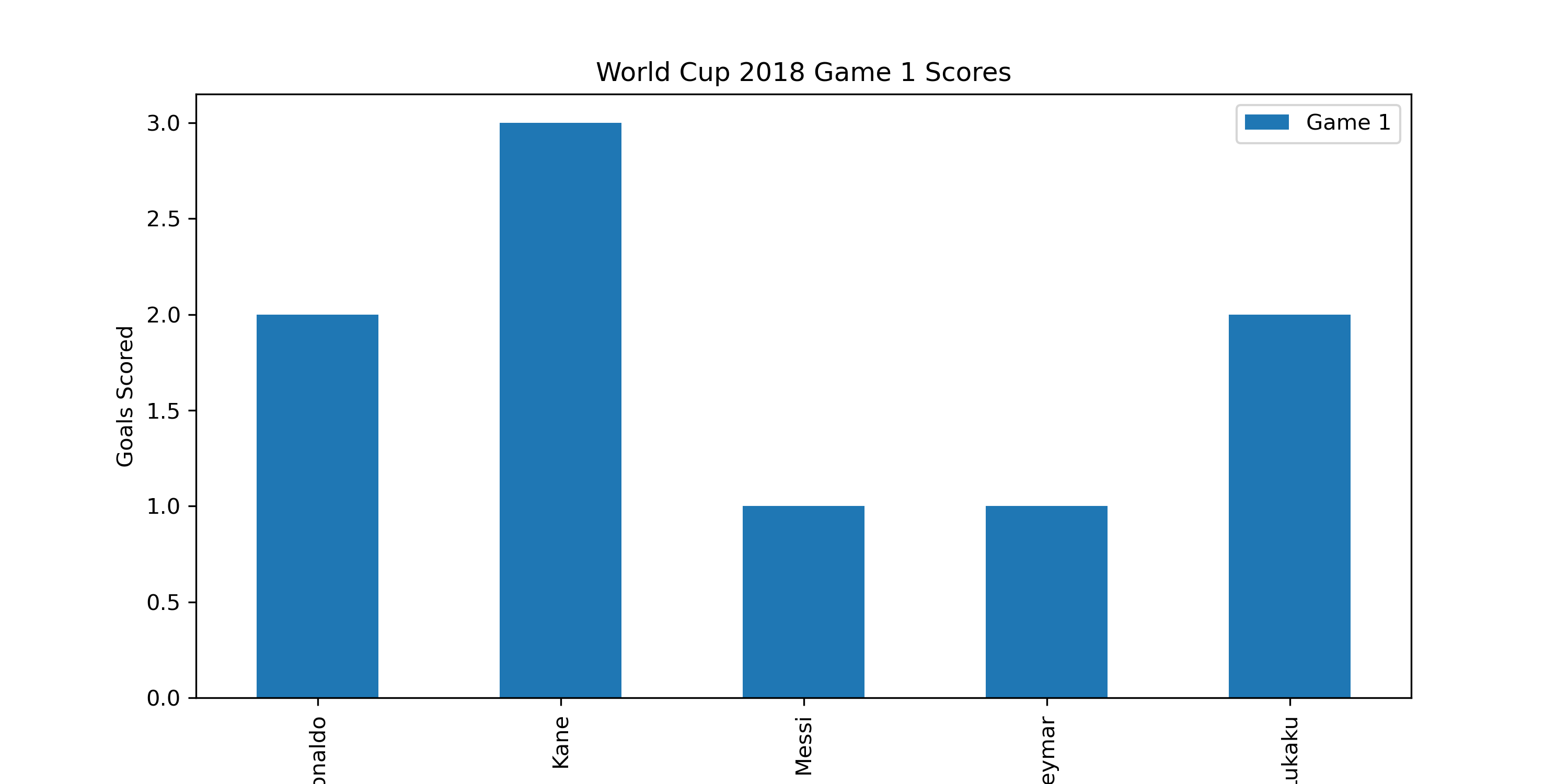
Multiple Bar Plot
We can also make multiple bars by category by calling the plot method on the full dataframe.
_ = sample_data.plot(kind='bar', figsize=(10,5))
plt.title('World Cup 2018 All Games Goals Scored')
plt.ylabel('Goals Scored')
plt.show()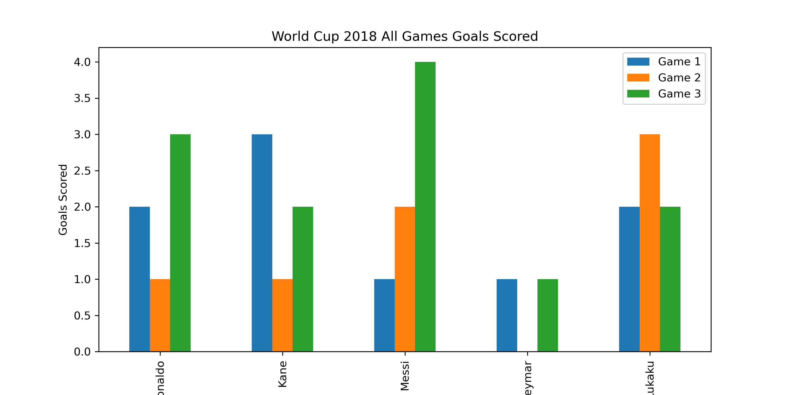
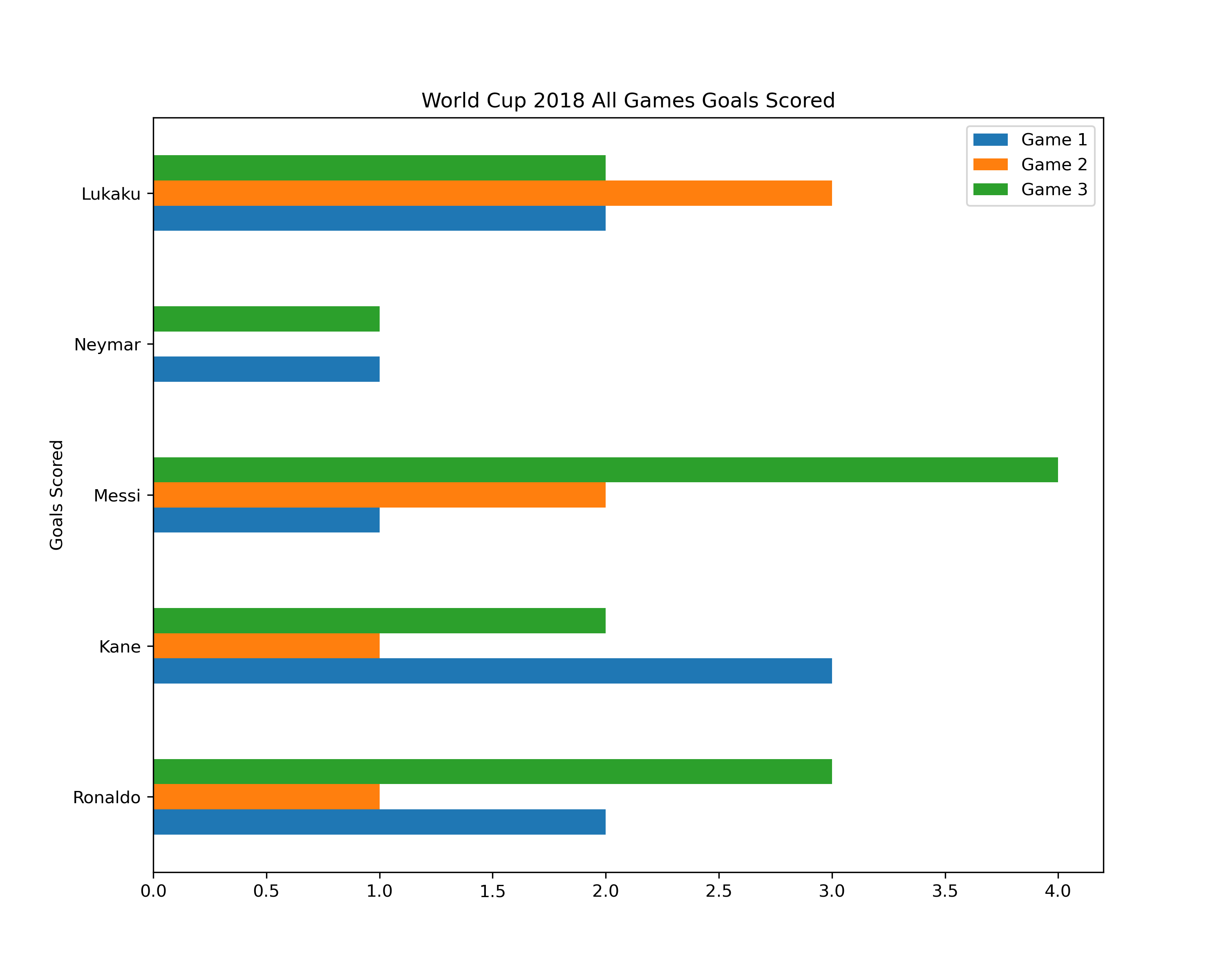
Horizontal Bar Plots
By default, matplotlib will produce a vertical bar chart. However, sometimes you may need to generate a horizontal bar plot. This this end, we only need to change the plot type to barh
_ = sample_data.plot(kind='barh', figsize=(10,8))
plt.title('World Cup 2018 All Games Goals Scored')
plt.ylabel('Goals Scored')
plt.show()