Correlation Plot
Correlation plots are an easy way to visualize the linear correlation between variable in dataframe. In this example we implement a correlation plot overlayed as a heat map to show how variables are correlated.
We will need to import the following packages
import pandas as pd
import seaborn as sns
import matplotlib.pyplot as plt

%matplotlib inline
%config InlineBackend.figure_format = 'retina'
In this notebook, I use a subset of housing data for the state of seattle.
housing_df = pd.read_csv('housing.csv')
housing_data.head()| lot_area | firstfloor_sqft | living_area | bath | garage_area | price | |
|---|---|---|---|---|---|---|
| 0 | 8450 | 856 | 1710 | 2 | 548 | 208500 |
| 1 | 9600 | 1262 | 1262 | 2 | 460 | 181500 |
| 2 | 11250 | 920 | 1786 | 2 | 608 | 223500 |
| 3 | 9550 | 961 | 1717 | 1 | 642 | 140000 |
| 4 | 14260 | 1145 | 2198 | 2 | 836 | 250000 |
We have a few features about the house and the corresponding price.
Correlation Matrix
To build our correlation plot, we first call the correlation method on the dataframe and pass the results to a seaborn heat map. Let's generate the correlation matrix for all the variables
housing_data.corr()| lot_area | firstfloor_sqft | living_area | bath | garage_area | price | |
|---|---|---|---|---|---|---|
| lot_area | 1.000000 | 0.299475 | 0.263116 | 0.126031 | 0.180403 | 0.263843 |
| firstfloor_sqft | 0.299475 | 1.000000 | 0.566024 | 0.380637 | 0.489782 | 0.605852 |
| living_area | 0.263116 | 0.566024 | 1.000000 | 0.630012 | 0.468997 | 0.708624 |
| bath | 0.126031 | 0.380637 | 0.630012 | 1.000000 | 0.405656 | 0.560664 |
| garage_area | 0.180403 | 0.489782 | 0.468997 | 0.405656 | 1.000000 | 0.623431 |
| price | 0.263843 | 0.605852 | 0.708624 | 0.560664 | 0.623431 | 1.000000 |
Correlation Heat Map
We can then use the correlation matrix above to plot our correlation heat map. We use seaborn heatmap method to plot the correlation
plt.figure(figsize=(10,8))
sns.heatmap(housing_data.corr(), annot=True, square=True, cmap="YlGnBu")
plt.title('Housing Data Correlation Plot')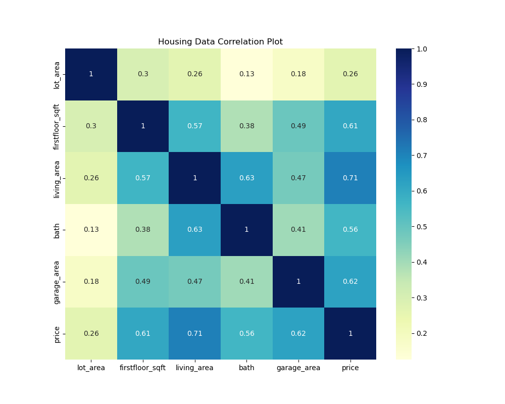
Heatmap Color Scheme
There are multiple possible coloring schemes for the heat map. Here are a few to try:
cmap="YlGnBu"
cmap="Blues"
cmap="BuPu"
cmap="YlGnBu"
cmap="Greens"