Pie Chart
Pie charts are useful in visualizing percentage composition of contributing elements to a metric. For example, you can think of how advertising bugdets are broken down into various channels of advertising like TV, Radio, New Paper and Online. On this notebook, we explore building simple pie charts using matplotlib
import matplotlib.pyplot as plt

%matplotlib inline
%config InlineBackend.figure_format = 'retina'  # Optional and only for Mac Users
We can generate some fictious marketing data by channel and put that information on two separate list objects
channels = ['TV', 'Radio', 'News Paper', 'Online', 'Direct Mail']
budget_proportion = [30, 15, 10 ,40, 5]
Generating base Pie Chart from matplotlib
fig = plt.figure(figsize=(7,7))
_ = plt.pie(budget_proportion, labels=channels, startangle=50,  autopct='%1.1f%%')
plt.title('Advertising Budget Spending')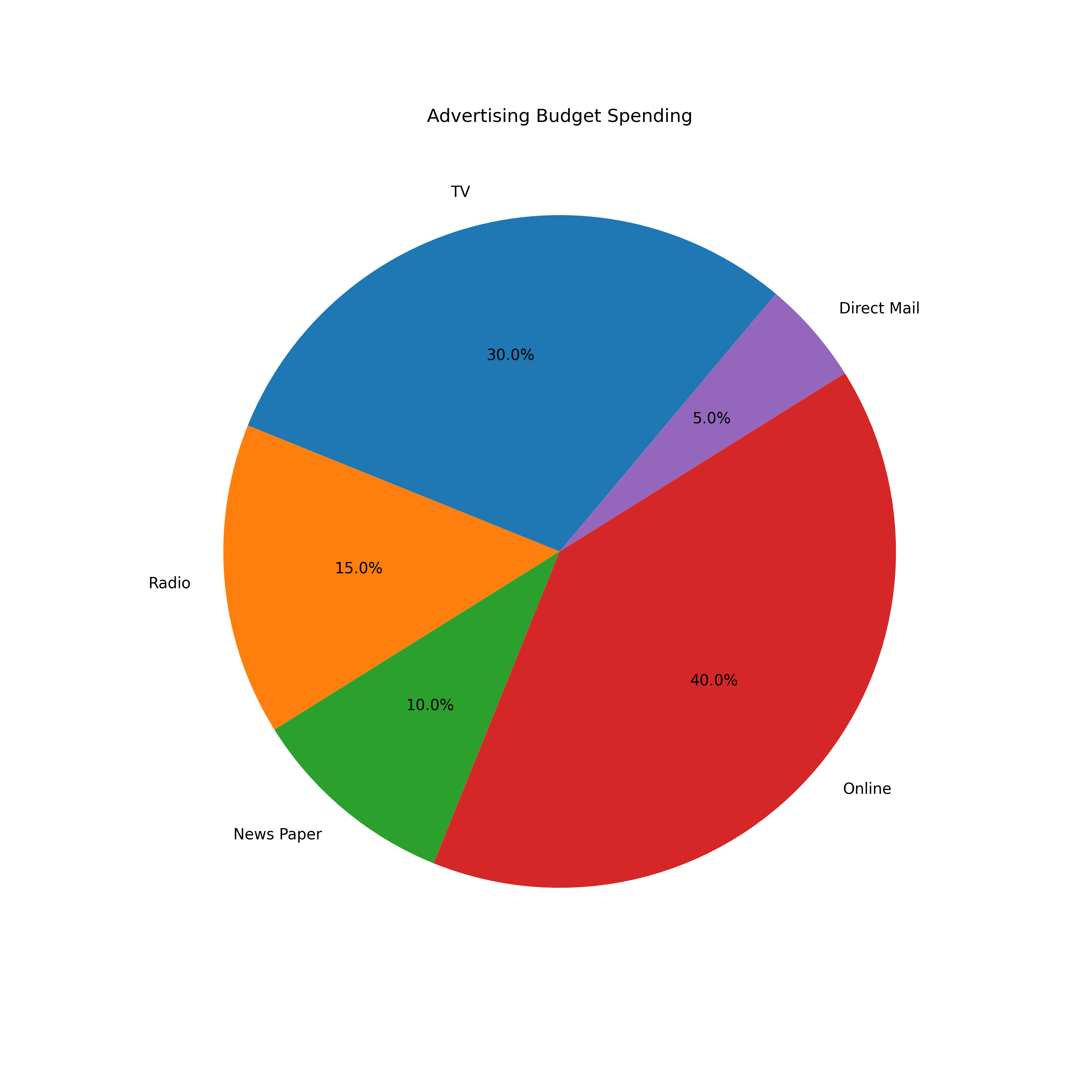
The base piechart is good enough for most cases however, you may wish to add some easthetics to your chart. We can introduce our own selected coloring scheme and perhaps split the pie slices.
Note that we can use the explore tuple to split the slices below
channels = ['TV', 'Radio', 'Direct Mail', 'News Paper', 'Online']
budget_proportion = [30, 15, 5, 10 , 40]
color_scheme = ['lightblue', 'orange', 'seagreen', 'violet', 'blue']
explode = (.1, 0, 0, 0,.12)

fig = plt.figure(figsize=(10,10))
_ = plt.pie(budget_proportion, labels=channels, startangle=50,  autopct='%1.1f%%', colors=color_scheme, explode=explode)
plt.title('Advertising Budget Spending')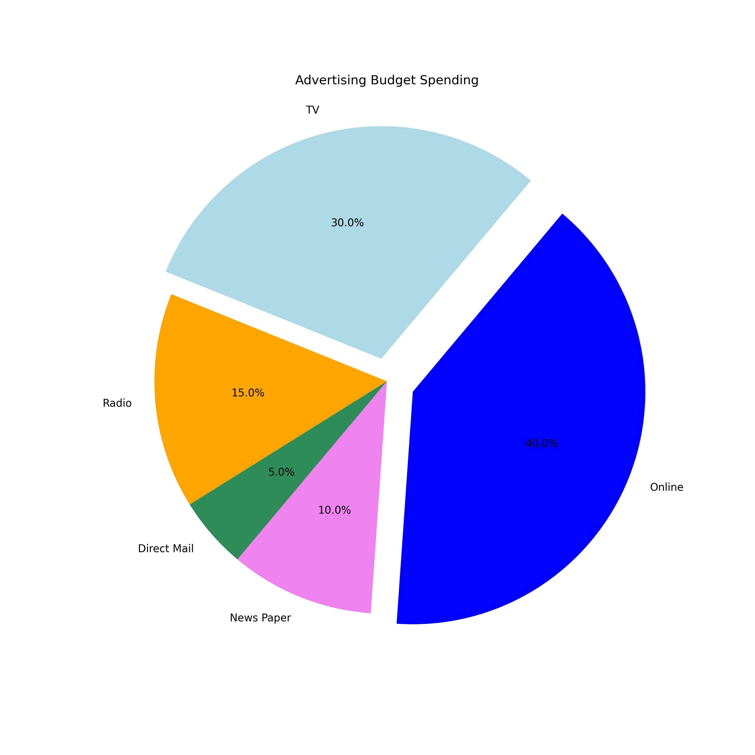
Now the pie plot looks a little more customized than the baze plot.