Scatter Plot
Scatter plots are often the first plots to be analyzed when two or more numerical data metrics have a relationship with each other. They determine the nature of the relationship between variables and how correlated they are i.e. linear positively correlated relationship. Being able to quickly gauge the relationship of two variables is valuable in understanding patterns and often informs the kind of statistical technique you need to use to make statistical inferences.
Let's build a simple scatter plot using some randomized values. We first import numpy and matplotlib
import numpy as np
import matplotlib.pyplot as plt

%matplotlib inline
%config InlineBackend.figure_format = 'retina'
Simulate some random observations
np.random.seed(43)

x_vals = np.random.normal(20, 10, 100)
y_vals =np.random.normal(30, 5, 100) - .5
We have generated random 100 values from a normal distribution centered at 20 with a standard deviation of 10 while y_values are centered at 30 with a standard deviation of 5. Because they are random variables, we expect there to be no specific relationship in our data.
To plot the scatter plot, we use the following code:
fig = plt.figure(figsize=(10,4))
plt.scatter(x_vals, y_vals, color='seagreen')
plt.xlabel('X-Values')
plt.ylabel('Y-Values')
plt.title('Scatter Plot: X vs Y Values')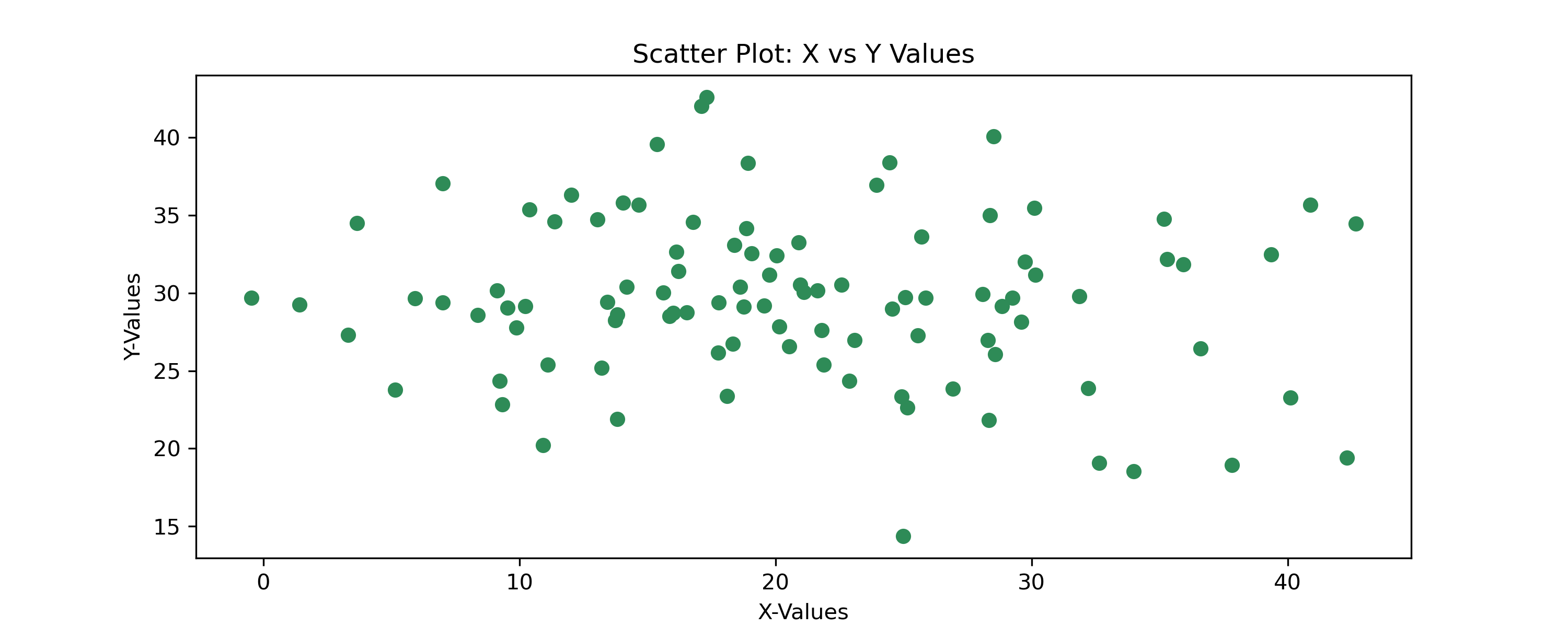
Chaning Markers
We can also change the markers and their size. Keyword arguments _marker_ and _s_ can be used to define the marker type and its size. To access all marker types, visit: https://matplotlib.org/api/markers_api.html
fig = plt.figure(figsize=(10,4))
plt.scatter(x_vals, y_vals, color='purple', marker='D', s=10)
plt.xlabel('X-Values')
plt.ylabel('Y-Values')
plt.title('Scatter Plot: X vs Y Values')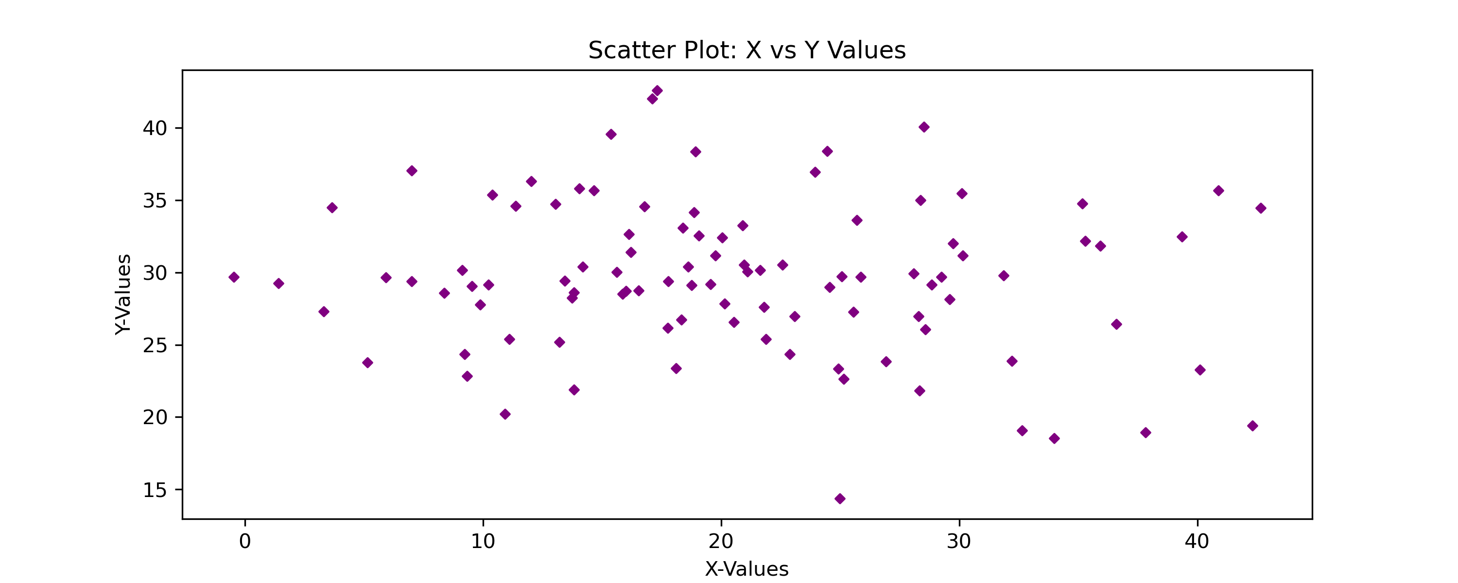
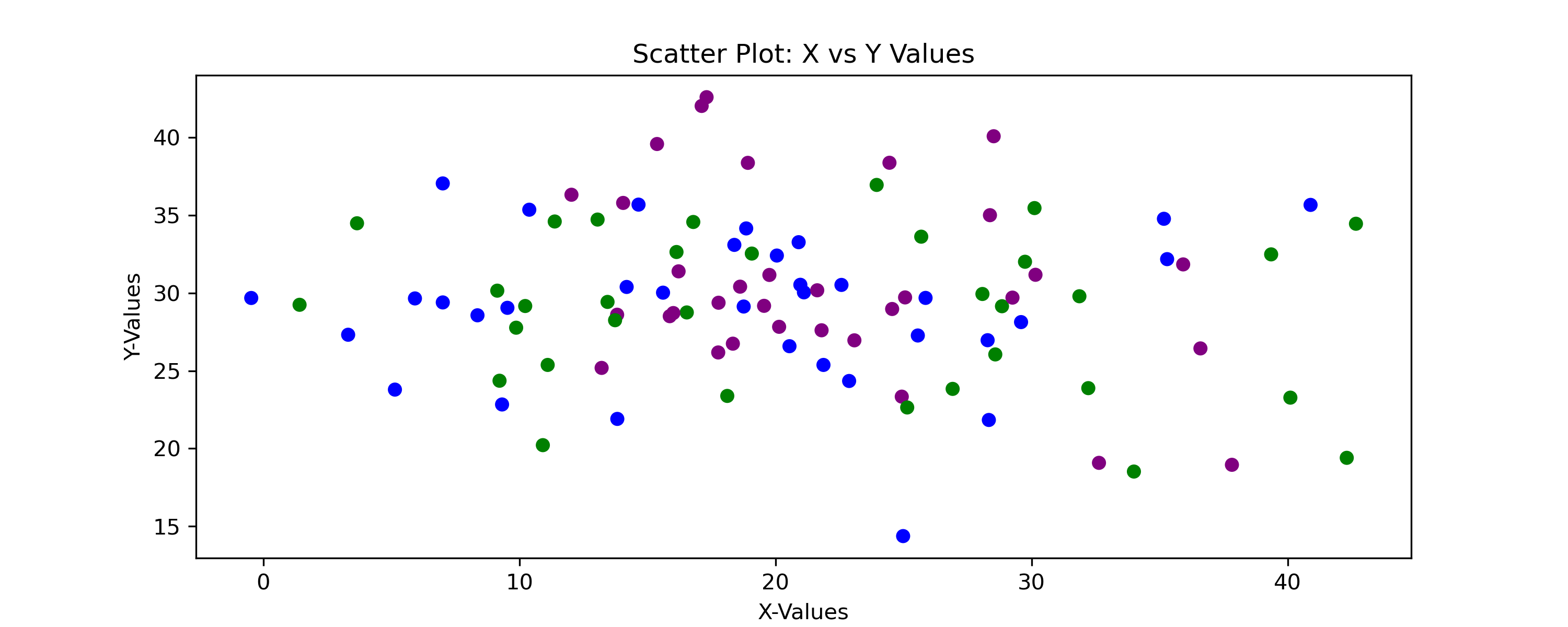
Multi-color scatter Plot
We can also render multi-color scatter plots. In the multivariate scatter plot, we will cover this more extensively but you can issue a sequence of colors to our scatter plot to plot difference colors sequentially.
import itertools

fig = plt.figure(figsize=(10,4))

colors = list(itertools.islice(itertools.cycle(['blue','green','purple']), len(x_vals)))
plt.scatter(x_vals, y_vals, color=colors, marker='o', s=30)
plt.xlabel('X-Values')
plt.ylabel('Y-Values')
plt.title('Scatter Plot: X vs Y Values')