Subplots with Matplotlib
Often times you may need to place multiple plots within a single output canvas. Matplotlib provides a subplot functionality that does exactly this. In the note book below, we explore building upto four subplots within a single plotting canvas.
We begin by loading the necessary packages.
import pandas as pd
import numpy as np
import matplotlib.pyplot as plt

%matplotlib inline
%config InlineBackend.figure_format = 'retina'
Simulating some data with numpy
sample_data = pd.DataFrame({'Date': pd.date_range('2017-01-01', '2017-12-31'),
        'Price': np.random.randint(30, 60, 365),
        'Difference': np.random.normal(size=365)})
sample_data.head()| Date | Price | Difference | |
|---|---|---|---|
| 0 | 2017-01-01 | 52 | -0.104868 |
| 1 | 2017-01-02 | 37 | 0.023333 |
| 2 | 2017-01-03 | 51 | -0.464959 |
| 3 | 2017-01-04 | 51 | 2.208272 |
| 4 | 2017-01-05 | 32 | 0.467390 |
Horizontal Subplots
We can plot the time series and scatter plot for price and difference respectively side by side using the following code. We use the add_subplot to determine the subplot grid.
Example:
1\. 121 - 1 row, 2 columns, 1st position
2\. 122 - 1 row, 2 columns, 2nd position
See implementation below
fig = plt.figure(figsize=(12,6))
plt.suptitle("Time Series and Scatter Plot of Price and Difference", y=1.02, fontsize=12)

fig.add_subplot(121)
plt.plot(sample_data.Date, sample_data.Price, color='violet', linestyle='-.')
plt.xlabel('Date')
plt.ylabel('Price')
plt.legend()

fig.add_subplot(122)
plt.scatter(sample_data.Difference, sample_data.Price, marker='*', color='seagreen')
plt.xlabel('Difference')
plt.ylabel('Price')

plt.tight_layout()
plt.show()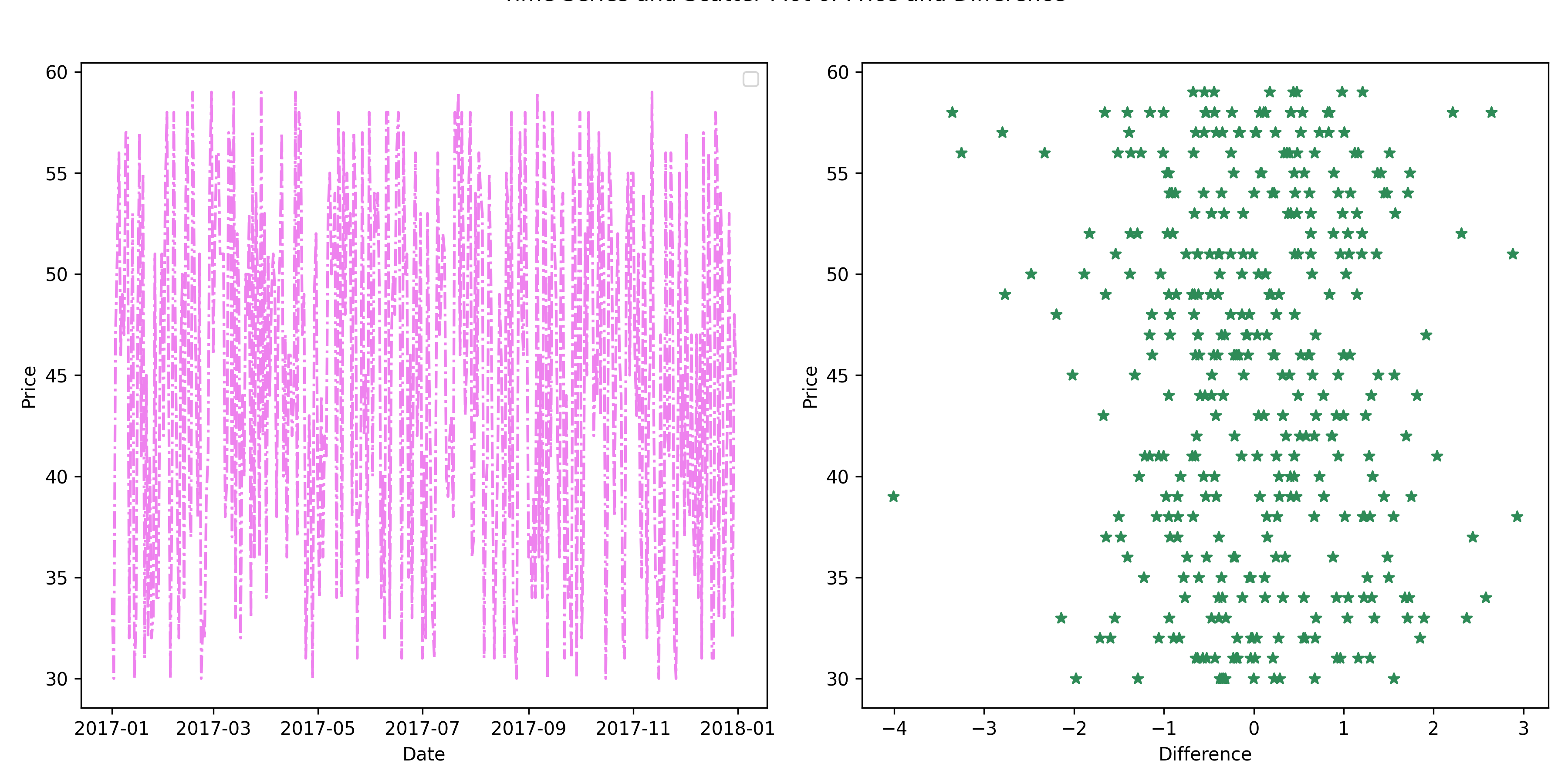
Vertical Subplots
Similar to what we did above, we define the canvas to have 2 rows and one column for vertical subplots
fig = plt.figure(figsize=(8,8))
plt.suptitle("Time Series and Scatter Plot of Price and Difference", y=1, fontsize=14)

fig.add_subplot(211)
plt.plot(sample_data.Date, sample_data.Price, color='violet', linestyle='-.')
plt.xlabel('Date')
plt.ylabel('Price')
plt.legend()

fig.add_subplot(212)
plt.hist(sample_data.Difference, ec='black', bins=40, color='lightgreen')
plt.xlabel('Difference Counts')
plt.ylabel('Difference')

plt.tight_layout()
plt.show()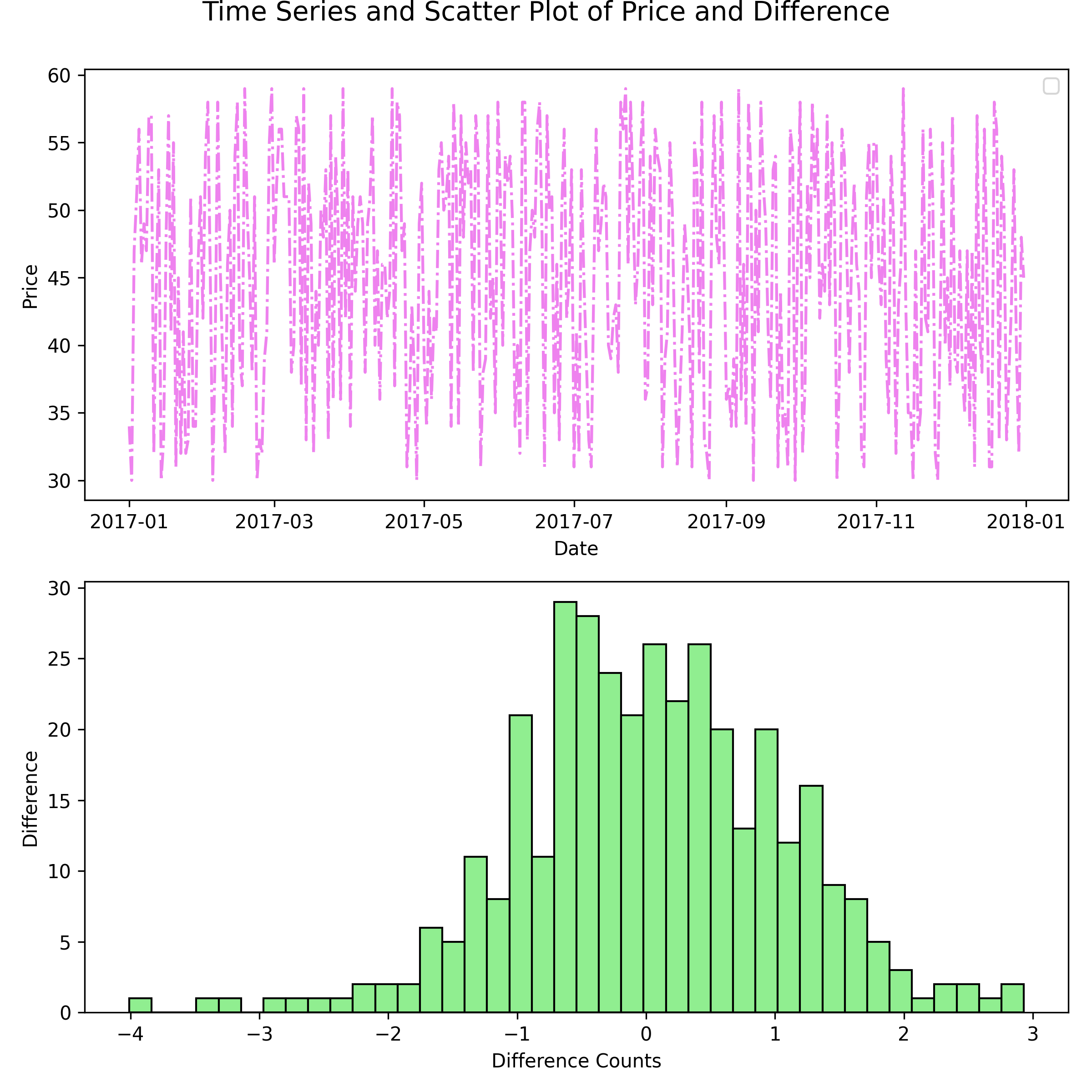
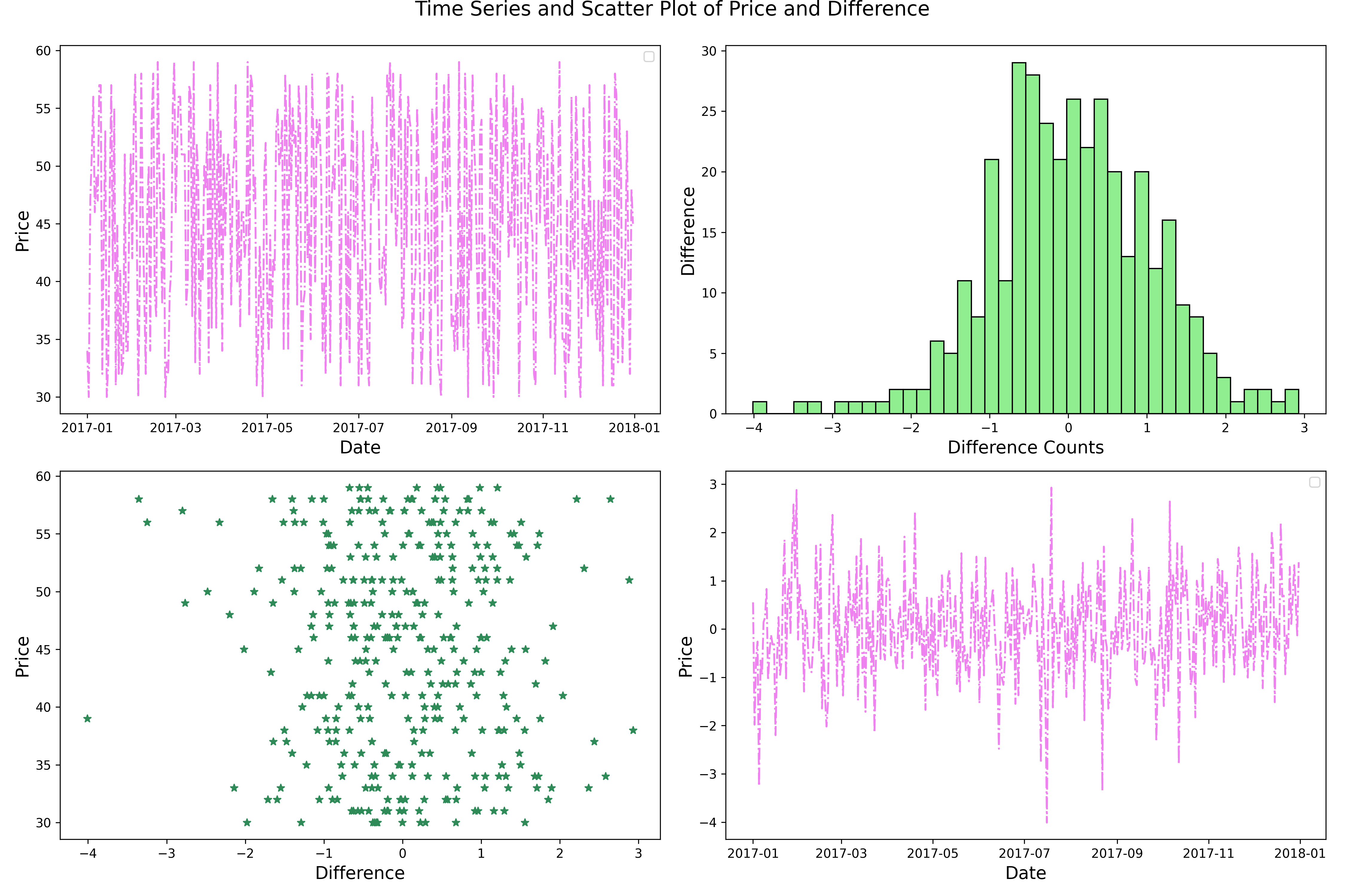
Four Subplots
Extending the same logic of specifying the rows and columns, we can generate a 4 subplot canvas by selecting a 2 by 2 canvas.
fig = plt.figure(figsize=(15,10))
plt.suptitle("Time Series and Scatter Plot of Price and Difference", y=1, fontsize=16)

fig.add_subplot(221)
plt.plot(sample_data.Date, sample_data.Price, color='violet', linestyle='-.')
plt.xlabel('Date',size=14)
plt.ylabel('Price', size=14)
plt.legend()

fig.add_subplot(222)
plt.hist(sample_data.Difference, ec='black', bins=40, color='lightgreen')
plt.xlabel('Difference Counts', size=14)
plt.ylabel('Difference', size=14)

fig.add_subplot(223)
plt.scatter(sample_data.Difference, sample_data.Price, marker='*', color='seagreen')
plt.xlabel('Difference', size=14)
plt.ylabel('Price', size=14)

fig.add_subplot(224)
plt.plot(sample_data.Date, sample_data.Difference, color='violet', linestyle='-.')
plt.xlabel('Date', size=14)
plt.ylabel('Price', size=14)
plt.legend()


plt.tight_layout()
plt.show()