Time Series Plots
Python offers many custom options for plotting time series models. Both matplotlib and seaborn have time series plotting methods. Let's implement a time series plot using some stock data from quandl
import quandl
import pandas as pd
import seaborn as sns
import matplotlib.pyplot as plt

%matplotlib inline
%config InlineBackend.figure_format = 'retina'
We use quandl to return stock data. The result is OHLCV metrics for both aggregate and adjusted at a daily level for all business days.
fb_stock = quandl.get('WIKI/FB', start_date='2017-01-01', end_date='2017-05-30', collapse='daily')
fb_stock.head()| Open | High | Low | Close | Volume | Ex-Dividend | Split Ratio | Adj. Open | Adj. High | Adj. Low | Adj. Close | Adj. Volume | |
|---|---|---|---|---|---|---|---|---|---|---|---|---|
| Date | ||||||||||||
| 2017-01-03 | 116.03 | 117.84 | 115.5100 | 116.86 | 20663912.0 | 0.0 | 1.0 | 116.03 | 117.84 | 115.5100 | 116.86 | 20663912.0 |
| 2017-01-04 | 117.55 | 119.66 | 117.2900 | 118.69 | 19630932.0 | 0.0 | 1.0 | 117.55 | 119.66 | 117.2900 | 118.69 | 19630932.0 |
| 2017-01-05 | 118.86 | 120.95 | 118.3209 | 120.67 | 19492150.0 | 0.0 | 1.0 | 118.86 | 120.95 | 118.3209 | 120.67 | 19492150.0 |
| 2017-01-06 | 120.98 | 123.88 | 120.0300 | 123.41 | 28545263.0 | 0.0 | 1.0 | 120.98 | 123.88 | 120.0300 | 123.41 | 28545263.0 |
| 2017-01-09 | 123.55 | 125.43 | 123.0400 | 124.90 | 22880360.0 | 0.0 | 1.0 | 123.55 | 125.43 | 123.0400 | 124.90 | 22880360.0 |
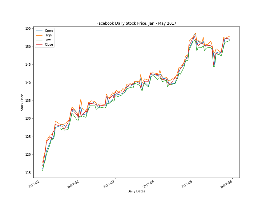
The best way to plot a time series chart with matplotlib is to leverage the date as the index and pass a dataframe with columns of interest to the plot method. The plot method will render all columns by color in the time series plot and provide a legennd for mapping. See example below.
fb_stock[['Open', 'High', 'Low' ,'Close']].plot(linestyle='-', linewidth=1.5, figsize=(10,6))
plt.xlabel('Daily Dates')
plt.ylabel('Stock Price')
plt.title('Facebook Daily Stock Price: Jan - May 2017')