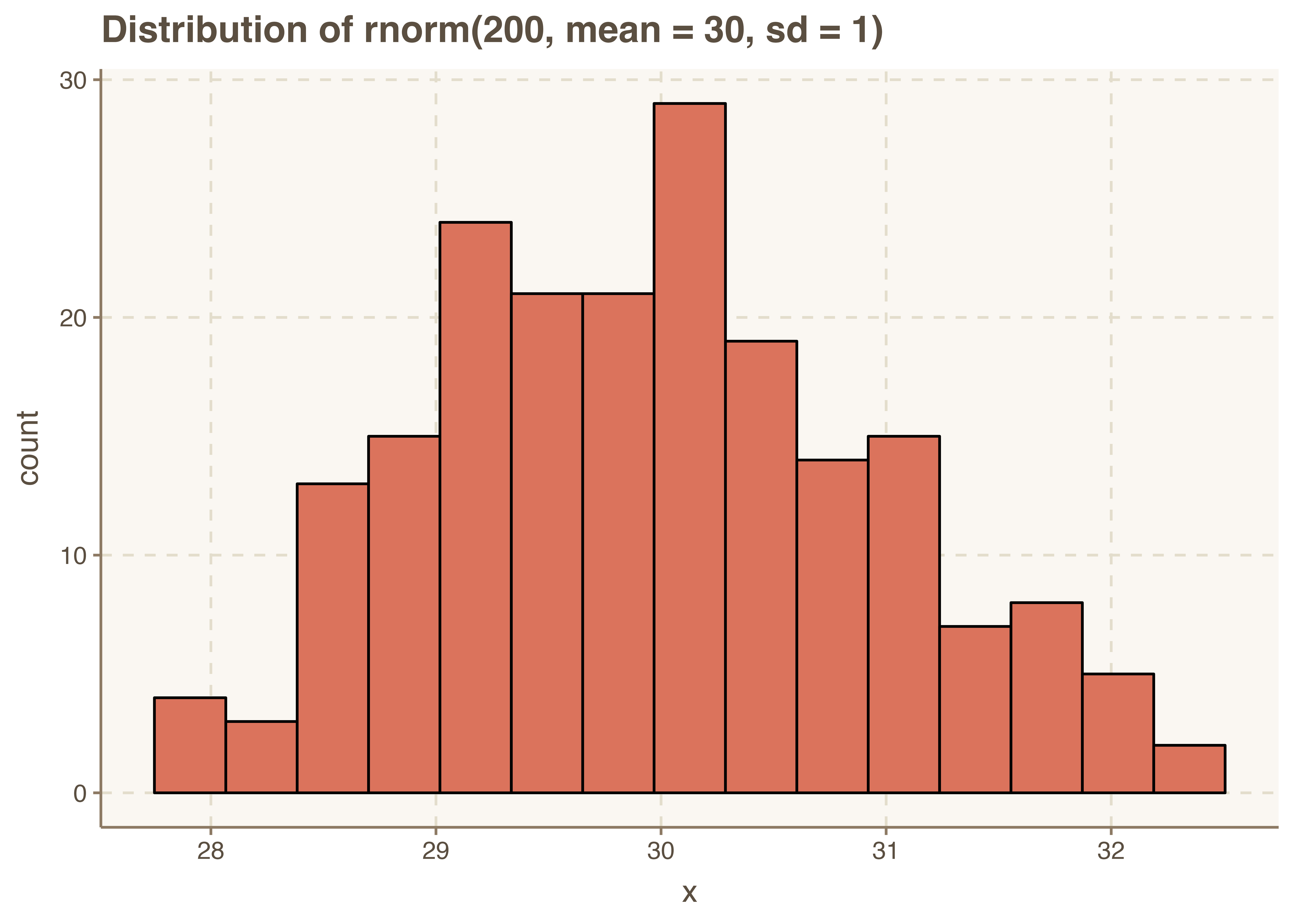
Histogram Chart
Histograms offer a visual representation of the frequency distribution of a univariable set of observations which give us insights into how the data is distributed.
In
library(ggplot2)
library(ggthemr)

ggthemr('dust')

#generating random data
x = rnorm(200, mean = 30, sd = 1)


# Generating histogram Plot
base <- ggplot(mapping = aes(x)) +
        geom_histogram( bins = 15, color="black" ) +
        ggtitle("Distribution of rnorm(200, mean = 30, sd = 1)")

base + xlab('x_values') + ylab('counts')