Bar Charts
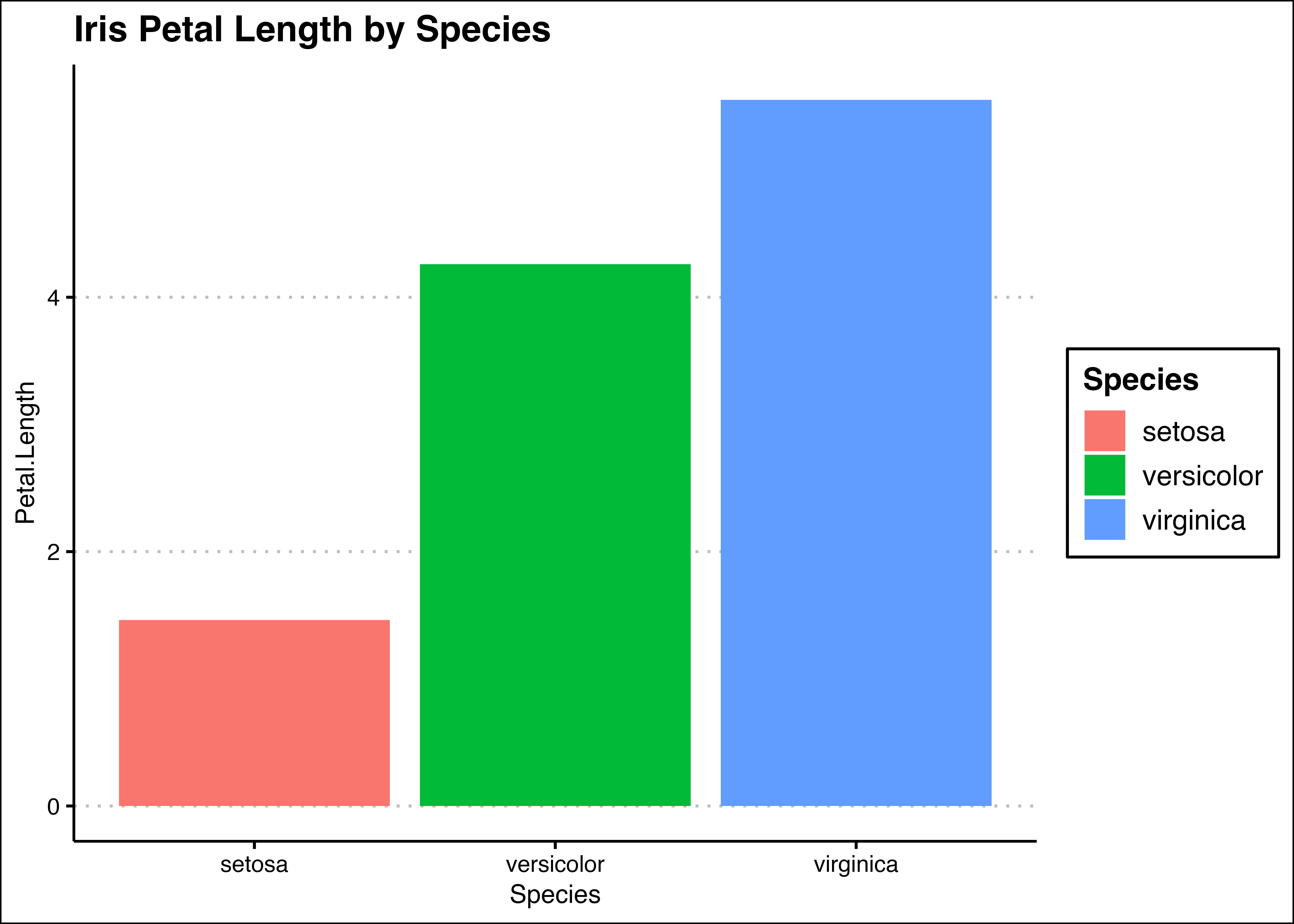
Bar charts are a go-to when you want to visually dissect and compare numerical attributes of different groups. Take, for instance, the task of assessing the average Petal Length across various species of flowers.
The example below not only talks the talk but walks the walk, showcasing a seamless implementation for your categorical numerical comparisons.
library(ggplot2)
library(datasets)
library(ggthemes)

# show top 5 rows
head(iris)| Sepal.Length | Sepal.Width | Petal.Length | Petal.Width | Species | |
|---|---|---|---|---|---|
| 1 | 5.1 | 3.5 | 1.4 | 0.2 | setosa |
| 2 | 4.9 | 3.0 | 1.4 | 0.2 | setosa |
| 3 | 4.7 | 3.2 | 1.3 | 0.2 | setosa |
| 4 | 4.6 | 3.1 | 1.5 | 0.2 | setosa |
| 5 | 5.0 | 3.6 | 1.4 | 0.2 | setosa |
| 6 | 5.4 | 3.9 | 1.7 | 0.4 | setosa |
Implementing Bar Chart with geom_bar()
For this example, the bar chart represents the mean of the Petal Lengths by Species of the Iris dataset. The implementation can be seen below:
# bar chart
bar_chart = ggplot( data = iris, aes( x = Species, y = Petal.Length, fill = Species )) +
            geom_bar( stat = "summary", fun = "mean" ) +
            ggtitle("Iris Petal Length by Species") + theme_clean()

bar_chart