Multiple Line Plot
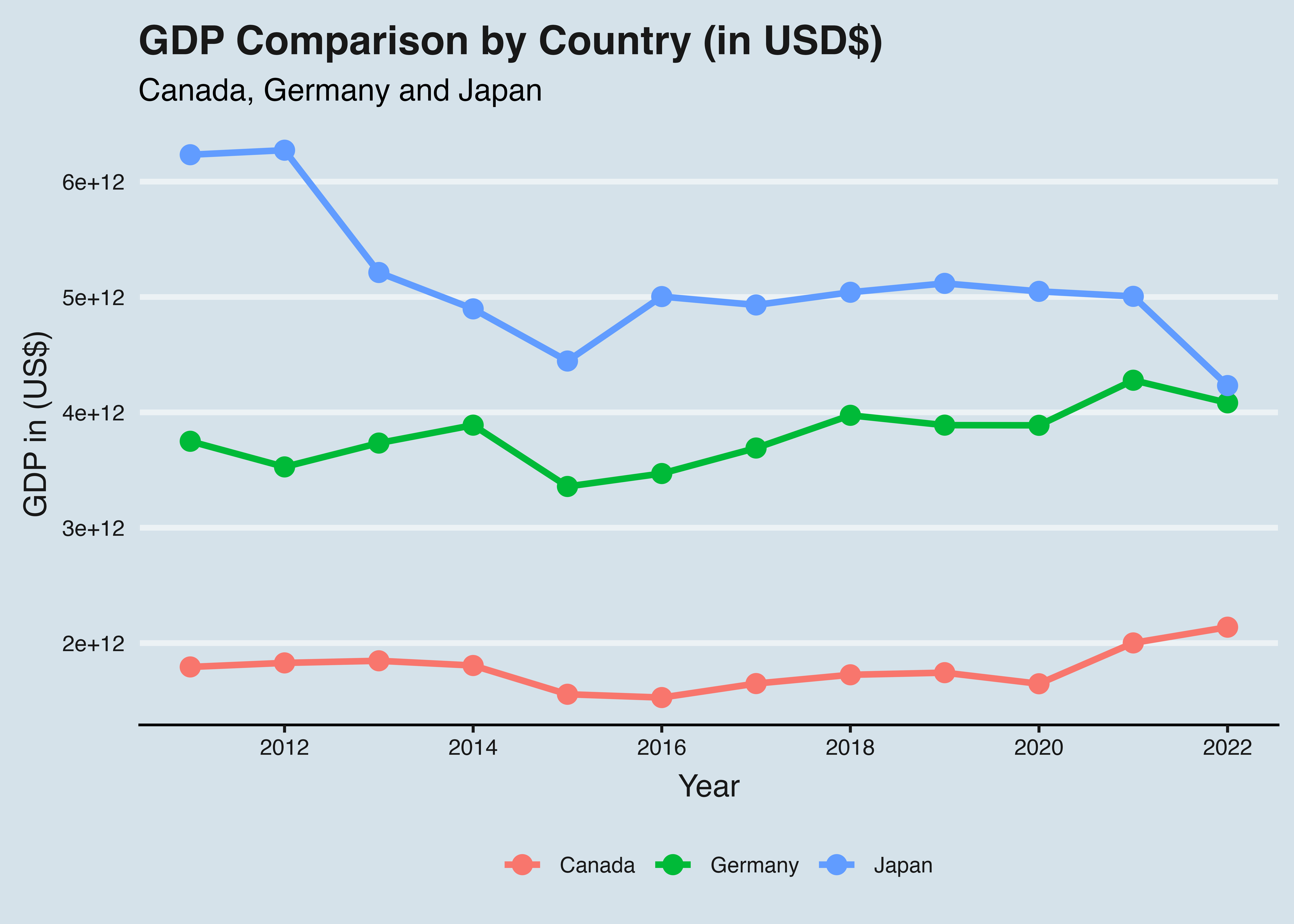
A multiple line plot is used for visualizing trends, patterns, or changes over time or across different categories for more than one group or variable simultaneously. It is particularly effective in comparing the progression of these variables, allowing analysts to identify correlations, contrasts, and interactions between them.
The example below implements multiple line plots for GDP data for three countries: Canada, Germany, Japan
library(tidyverse)
library(ggplot2)

# read the data
data = read.csv('../data/gdp_time_series.csv')
head(data)| Country.Name | Year | GDP | |
|---|---|---|---|
| <chr> | <int> | <dbl> | |
| 1 | Canada | 2000 | 7.447734e+11 |
| 2 | Canada | 2001 | 7.389818e+11 |
| 3 | Canada | 2002 | 7.606493e+11 |
| 4 | Canada | 2003 | 8.955406e+11 |
| 5 | Canada | 2004 | 1.026690e+12 |
| 6 | Canada | 2005 | 1.173109e+12 |
Implementing Multiple Line Plots - Economist Theme
To implement the line plots, I leverage
# Multiple line plot
ggplot(data = data, aes( x = Year, y = GDP, colour = Country.Name )) +
geom_line(linewidth = 1.2) +
geom_point(size = 3.2) +
scale_x_continuous(breaks = seq(2000,2022,3)) +
labs( title="GDP Comparison by Country (in USD$)",
      subtitle = 'Canada, Germany and Japan',
      x = 'Year', y = 'GDP in (US$)') +
theme_economist() +
theme( axis.line.x = element_line(size = .5, colour = "black"),
       legend.position = "bottom",
       legend.direction = "horizontal",
       legend.title = element_blank(),
       text = element_text(size = 14))