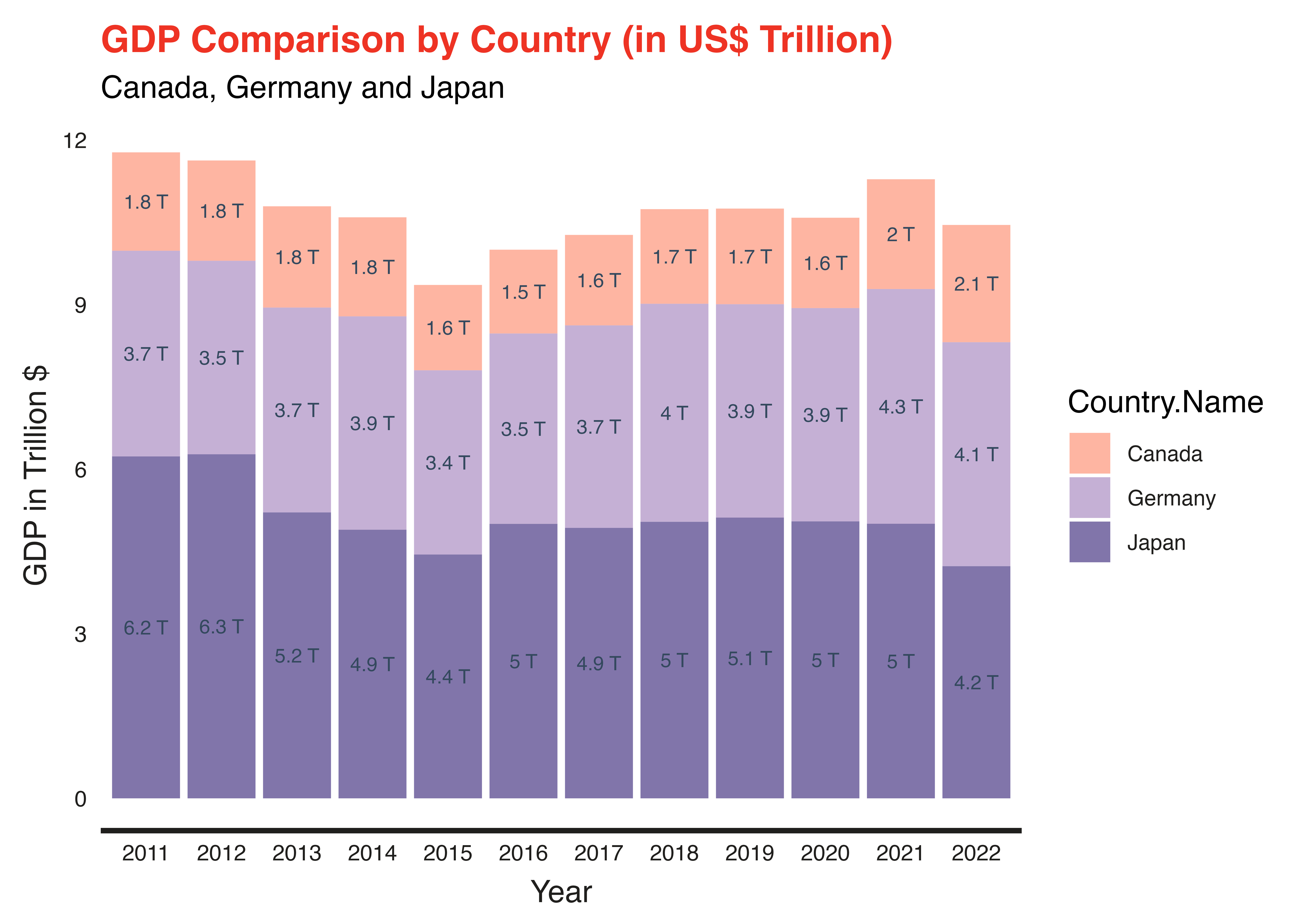
Stacked Column Chart
A stacked column chart is a type of graphical data representation that displays multiple categories of data stacked on top of each other in vertical columns. This format is particularly useful for comparing the composition of different categories at various points, allowing for easy visualization of part-to-whole relationships and trends over time within a dataset.
Below is an implementation of the Stacked Column Chart in ggplot.
library(tidyverse)
library(ggplot2)
library(dplyr)
library(artyfarty)

data = read.csv('../data/gdp_time_series.csv')
head(data)
| Country.Name | Year | GDP | |
|---|---|---|---|
| <chr> | <int> | <dbl> | |
| 1 | Canada | 2000 | 7.447734e+11 |
| 2 | Canada | 2001 | 7.389818e+11 |
| 3 | Canada | 2002 | 7.606493e+11 |
| 4 | Canada | 2003 | 8.955406e+11 |
| 5 | Canada | 2004 | 1.026690e+12 |
| 6 | Canada | 2005 | 1.173109e+12 |
data = data %>%
       filter(Year > 2010) %>%
       mutate(Year = as.factor(Year)) %>%
       mutate(gdp_label = paste(round(GDP/1000000000000, 2), "T"),
              GDP = GDP/1000000000000)
options(repr.plot.width = 14, repr.plot.height = 8)

colors = c( '#feb5a2', '#c5b0d5', '#8175aa')
column_chart = ggplot( data = data, aes(x = Year, y = GDP, fill = Country.Name)) +
               labs( title = 'GDP Comparison by Country (in $US Trillion)',
                     subtitle = "Canada, Germany and Japan",
                     y = "GDP in Trillion $") +
               geom_col() +
               theme( legend.position = "bottom",
                      legend.direction = "horizontal",
                      legend.title = element_blank(),
                      text = element_text(size = 20)) +
               geom_text( aes(label = gdp_label), position = position_stack(vjust = .5), size = 5) +
               theme( legend.position = "bottom", legend.direction = "horizontal") +
               scale_fill_manual( values = colors) +
               theme_bain()

column_chart