Decision Tree Classifier
A Decision Tree is a non-parametric supervised learning method used for classification and regression. The goal is to create a model that predicts the value of a target variable by learning simple decision rules inferred from the data features. A tree can be seen as a piecewise constant approximation. Decision trees are popular because they are easy to interpret, handle both numerical and categorical data, and require little data preparation.
Sample Decision Tree
Figure is taken from Machine Learning with R, Tidyverse and MLR -Textbook
Some important terminology here:
- Root Node: The root node is the parent node that determines the partition of the rest of the tree. It contains all data prior to splitting.
- Decision Nodes: The decision nodes are subsequent nodes that further split the data into either decision nodes or leaf nodes.
- Leaf Nodes: Leaf nodes are the end point of the tree, they house the class/label of the observations.
Instinctively, we may wish to ask, given the knowledge of the nature of a decision tree, how it is that the algorithm we choose to use will decide how the tree is formed. In particular, there are three questions to consider:
- What variable makes the best root node?
- Which variables make the best decision nodes?
- In what order should these decision nodes be?
Entropy and Theory of Information
Entropy is a concept commonly linked to physics and mathematics that concerns with the measure of chaos in a system. To reduce it to our use in data analytics and machine learning, entropy is a technique that attempts to measure impurity present within a particular data set. In order words, we can use it to measure how homogeneous our data set is. This is useful because as we seek to classify objects, we wish to reduce impurity, or phrased differently, maximize homogeneity.
Formally, Entropy of a variable can be calculated using the following formula:
$$ (Shannon's)Entropy = H(Y, X) = - \sum_{i=1}^{m} p_i * log_2(p_i) $$
where
$Y$: categorical dependent variable
$X_k$: Set of predictor variables with $k$ distinct values.
$p$ is the probability of a certain category $m$ in $Y$.
Entropy Example for the Binary Case
Let's look at an example of the Binary case, where the labels belong to two classes only. The code below will evaluate the entropy against different composition of the labels. For simplicity, let's say, if there are labels $A$ and $B$, we will generate different proportions for A and B will equal to $1-p(A)$.
The general formula for Entropy for Binary case is then:
$$ Entropy = - p(A) * log_2(P(A)) - (1 - P(A)) * log2(1 - p(A)) = -plog_2(p) - (1 - p)log_2(1 - p) $$
import numpy as np
import matplotlib.pyplot as plt

def entropy_binary(p, base=2):
    """
    Computes the entropy of a binary system.
    Handles edge cases p=0 and p=1 to avoid log(0).
    """
    # Use small epsilon to avoid log(0)
    eps = np.finfo(float).eps
    p = np.clip(p, eps, 1 - eps)
    q = 1 - p
    # Compute entropy
    H = - (p * np.log(p) / np.log(base) + q * np.log(q) / np.log(base))
    return H

# Create a sequence of probability values from 0 to 1
p_values = np.linspace(0, 1, 1000)

# Calculate entropy for each probability
H_values = entropy_binary(p_values)

# Plot the entropy as a function of probability
plt.figure(figsize=(10, 6))
plt.plot(p_values, H_values, color='blue', linewidth=2)
plt.title('Entropy of a Binary System')
plt.xlabel('Probability (p)')
plt.ylabel('Entropy H(p) [bits]')
plt.grid(True, linestyle='--', alpha=0.7)

# Save the plot
plt.savefig('binary_entropy.png', dpi=300, bbox_inches='tight')
plt.show()
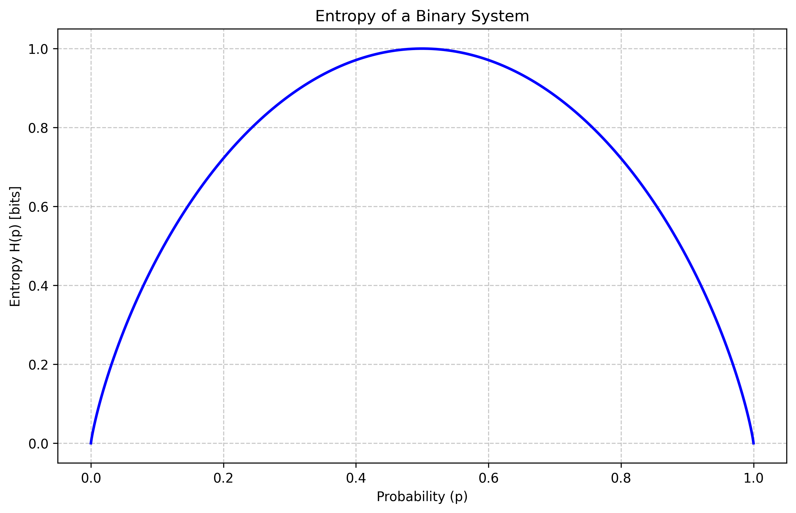
Think through the interpretation of the Curve above. Specifically, Entropy of a system when the probabilities of $A$ and $B$ are at .5. That is, at the highest randomness, the entropy is high. As the probability of an individual label becomes higher than the other, the entropy reduces.
How to Pick Nodes - Expected Entropy and Information Gain
The entropy calculation gives us everything we need to be able to select nodes for splits. Naturally, with a few modifications, we can apply entropy to develop a more useful measure that tells us exactly how much impurity we would reduce by selecting a specific node. To do this we need two more modified versions of entropy:
1.1. Expected Entropy
The first idea is the expected Entropy. The Expected Entropy provides an estimated entropy value when a particular variable is selected. It does this by computing the Expected Entropy of the child nodes given the probabilities of their categories. Mathematically, the formula is:
Suppose an Attribute $A$ with $k$ distinct values is selected as a node, to get the expected entropy, we compute the following:
$$ EH(A) = \sum_{i=1}^{k} \frac {p_i + n_i} {p + n} H(\frac {p_i}{p_i + n_i}, \frac{n_i}{p_i + n_i} ) $$
Let us use an example to demonstrate the computation above:
Suppose we have 12 observations equally distributed of a label as to whether an individual will play a game based on weather (and other factors). On this example, we will use the weather as a node to compute the EH value.
$$ EH(Weather) = p_{rainy} * H(p_{rainy, play}, p_{rainy,not\ play}) + p_{sunny} * H(p_{sunny,play}, p_{sunny,not\ play}) + p_{cloudy} * H(p_{cloudy,play}, p_{cloudy,not\ play}) $$
To implement it directly, the EH(Weather) is given by:
$$ EH(Weather) = \frac {2}{12} * H(0, 1) + \frac {4}{12} * H(1, 0) + \frac {6}{12} * H(2/6, 4/6) = .4589 $$
1.2. Information Gain
In the above example, we have calculated Expected Entropy at a given column variable. In reality we will have to compute these for all variables. However this is till not sufficient, the final piece is to get the information gain which is the difference between entropy of the complete data set and the entropy at the variable.
$$IG = H(Y,X) - EH(A)$$
For our example above, this will correspond to:
$$ IG(weather) = 1 - EH(Weather) = 1 - .4589 = .541 $$
So by choosing the Weather variable, we have reduced the chaos, or gained information from 1 to .541. Typically we do this across all the variables and do it recursively until we have the tree.
The Dataset
For this task, we will use the Carseats dataset (car_seats_sales.csv). This dataset contains simulated data about sales of child car seats at 400 different stores.
Metadata
Sales: Unit sales (in thousands) at each location.
CompPrice: Price charged by competitor at each location.
Income: Community income level (in thousands of dollars).
Advertising: Local advertising budget for company at each location (in thousands of dollars).
Population: Population size in region (in thousands).
Price: Price company charges for car seats at each site.
ShelveLoc: A factor with levels Bad, Good and Medium indicating the quality of the shelving location for the car seats at each site.
Age: Average age of the local population.
Education: Education level at each location.
Urban: A factor with levels No and Yes to indicate whether the store is in an urban or rural location.
US: A factor with levels No and Yes to indicate whether the store is in the US or not.
Importing Libraries
We import the necessary modules for the Decision Tree analysis.
import pandas as pd
import numpy as np
from sklearn.model_selection import train_test_split
from sklearn.tree import DecisionTreeClassifier, plot_tree
from sklearn.metrics import accuracy_score, classification_report, confusion_matrix, roc_auc_score, roc_curve
import matplotlib.pyplot as plt
import seaborn as sns
Loading and Preparing the Data
First, we load the dataset and take a quick look at its structure.
data = pd.read_csv('car_seats_sales.csv')
print(data.head())
print(data.info())
print(data.describe())Exploratory Data Analysis (EDA)
We explore the distribution of sales and the relationships between features like shelving location and price.
# Distribution of Sales
plt.figure(figsize=(10, 6))
sns.histplot(data['Sales'], kde=True, color='green')
plt.title('Distribution of Sales')
plt.savefig('dt_eda_dist.png', dpi=300, bbox_inches='tight')
plt.show()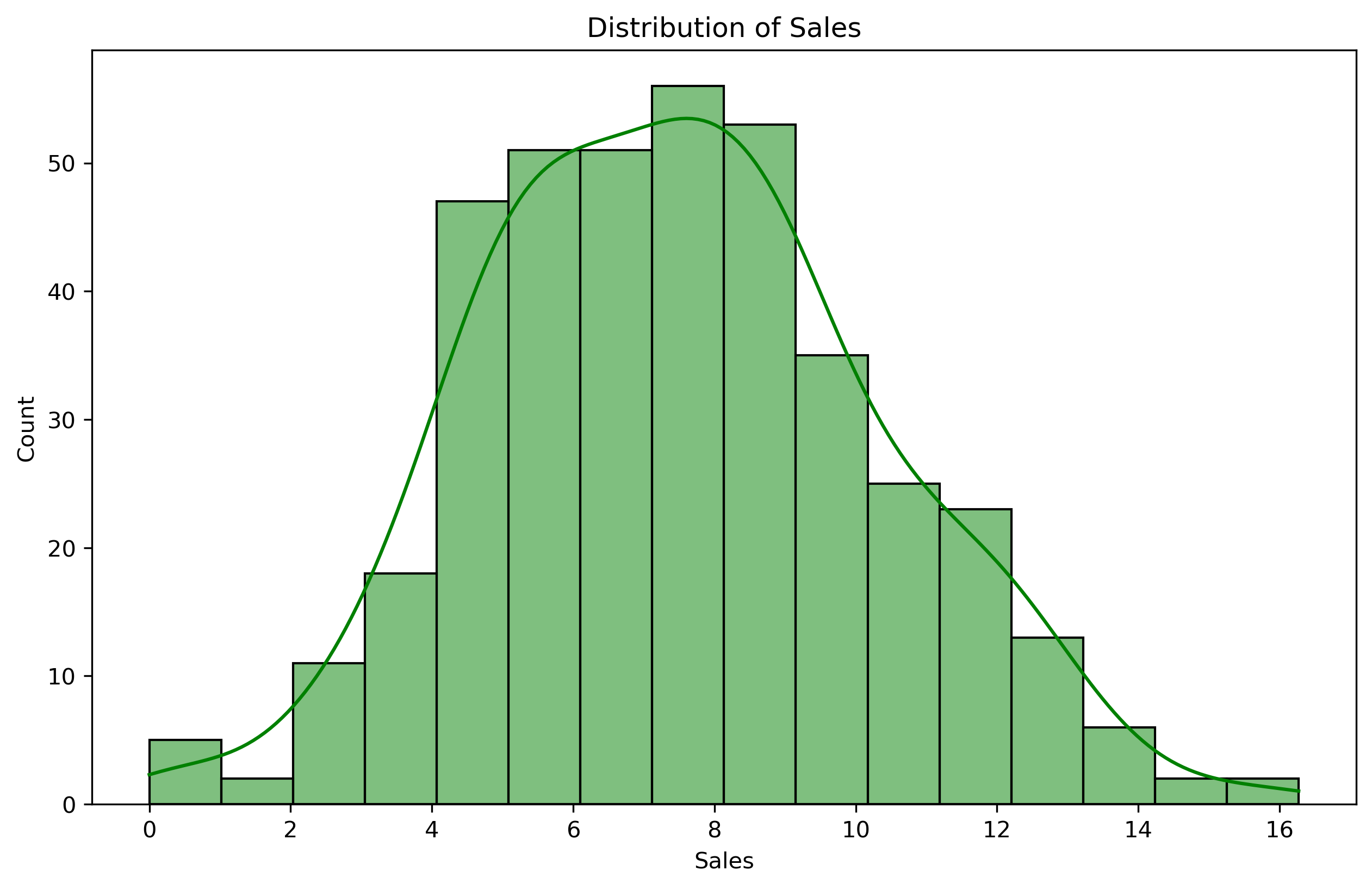
# Sales vs Shelving Location
plt.figure(figsize=(10, 6))
sns.boxplot(x='ShelveLoc', y='Sales', data=data, palette='Set3', order=['Bad', 'Medium', 'Good'])
plt.title('Sales vs Shelving Location')
#plt.savefig('dt_eda_box.png', dpi=300, bbox_inches='tight')
plt.show()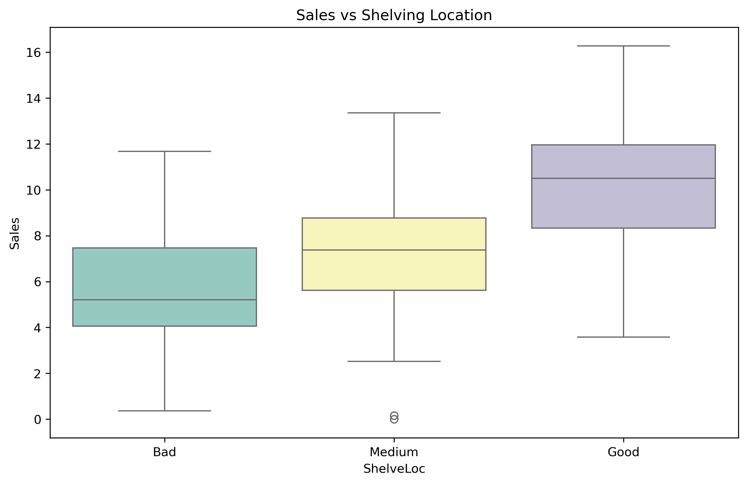
# Correlation Heatmap
plt.figure(figsize=(12, 10))
numeric_cols = data.select_dtypes(include=[np.number]).columns
sns.heatmap(data[numeric_cols].corr(), annot=True, cmap='coolwarm', fmt='.2f')
plt.title('Correlation Heatmap')
#plt.savefig('dt_eda_corr.png', dpi=300, bbox_inches='tight')
plt.show()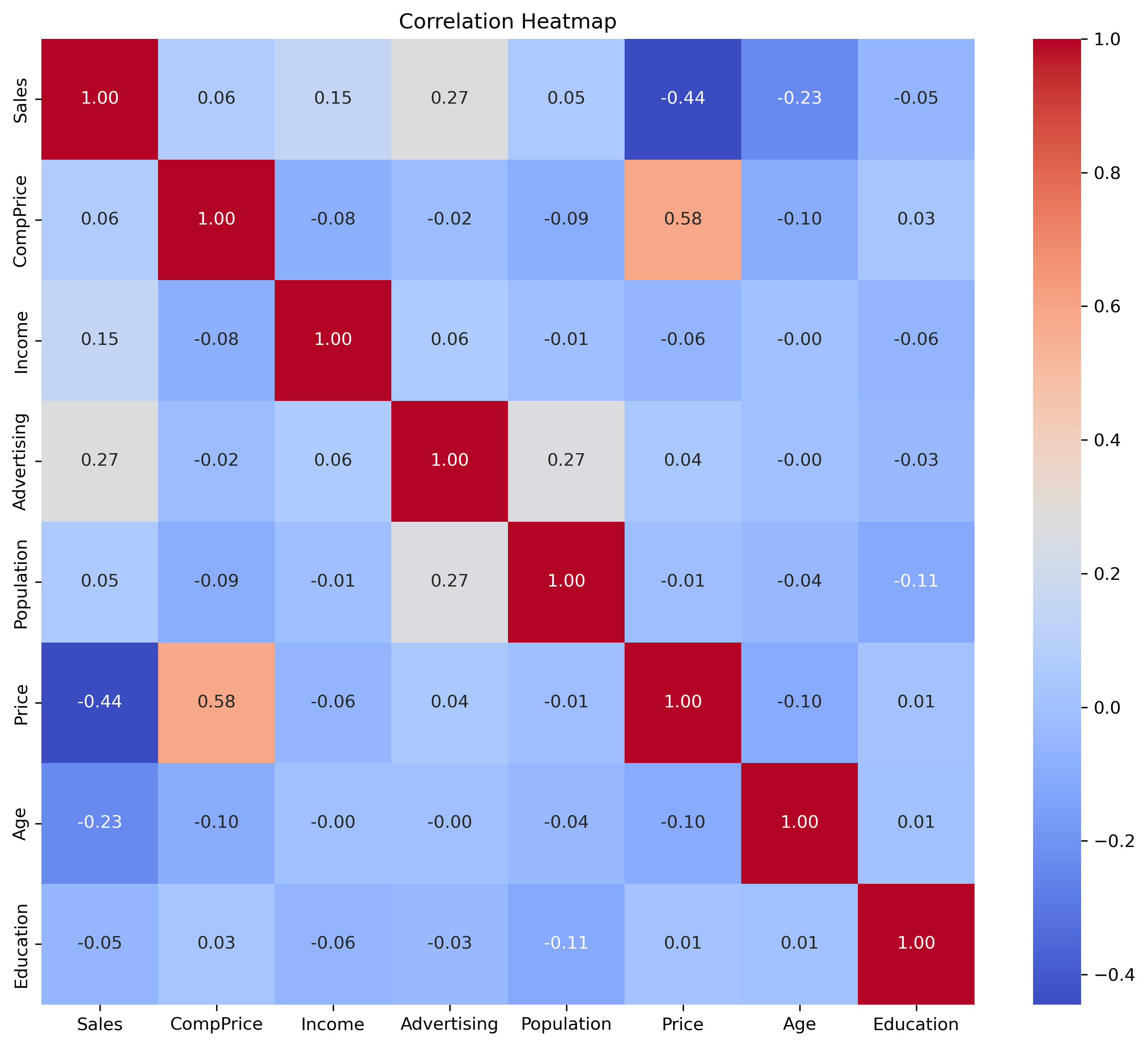
Data Preprocessing
We convert 'Sales' to a binary 'High' column (Sales > 8) and encode categorical variables into numerical format.
# Create binary classification problem: High (Sales > 8)
data['High'] = data['Sales'].apply(lambda x: 1 if x > 8 else 0)
data = data.drop('Sales', axis=1)

# Encode categorical variables
data['ShelveLoc'] = data['ShelveLoc'].map({'Bad': 0, 'Medium': 1, 'Good': 2})
data['Urban'] = data['Urban'].map({'No': 0, 'Yes': 1})
data['US'] = data['US'].map({'No': 0, 'Yes': 1})

X = data.drop('High', axis=1)
y = data['High']

# Splitting into training and testing sets
X_train, X_test, y_train, y_test = train_test_split(X, y, test_size=0.2, random_state=42)
Model Training
We train a Decision Tree Classifier with a maximum depth of 5 to avoid overfitting and ensure interpretability.
# Initialize the model
model = DecisionTreeClassifier(max_depth=5)

# Fit the model
model.fit(X_train, y_train)
Model Evaluation
We evaluate the model using Accuracy, Confusion Matrix, Classification Report, and ROC AUC.
# Predictions
y_pred = model.predict(X_test)
y_prob = model.predict_proba(X_test)[:, 1]

# Metrics
print(f"Accuracy: {accuracy_score(y_test, y_pred)}")
print("\nConfusion Matrix:")
print(confusion_matrix(y_test, y_pred))
print("\nClassification Report:")
print(classification_report(y_test, y_pred))
print(f"\nROC AUC: {roc_auc_score(y_test, y_prob):.4f}")Visualizations
We visualize the Confusion Matrix, ROC Curve, and the Decision Tree structure.
# Plot Confusion Matrix
plt.figure(figsize=(8, 6))
sns.heatmap(confusion_matrix(y_test, y_pred), annot=True, fmt='d', cmap='Greens',
            xticklabels=['Low/Medium', 'High'], yticklabels=['Low/Medium', 'High'])
plt.title('Confusion Matrix - Decision Tree')
plt.xlabel('Predicted')
plt.ylabel('Actual')
plt.savefig('dt_cm.png', dpi=300, bbox_inches='tight')
plt.show()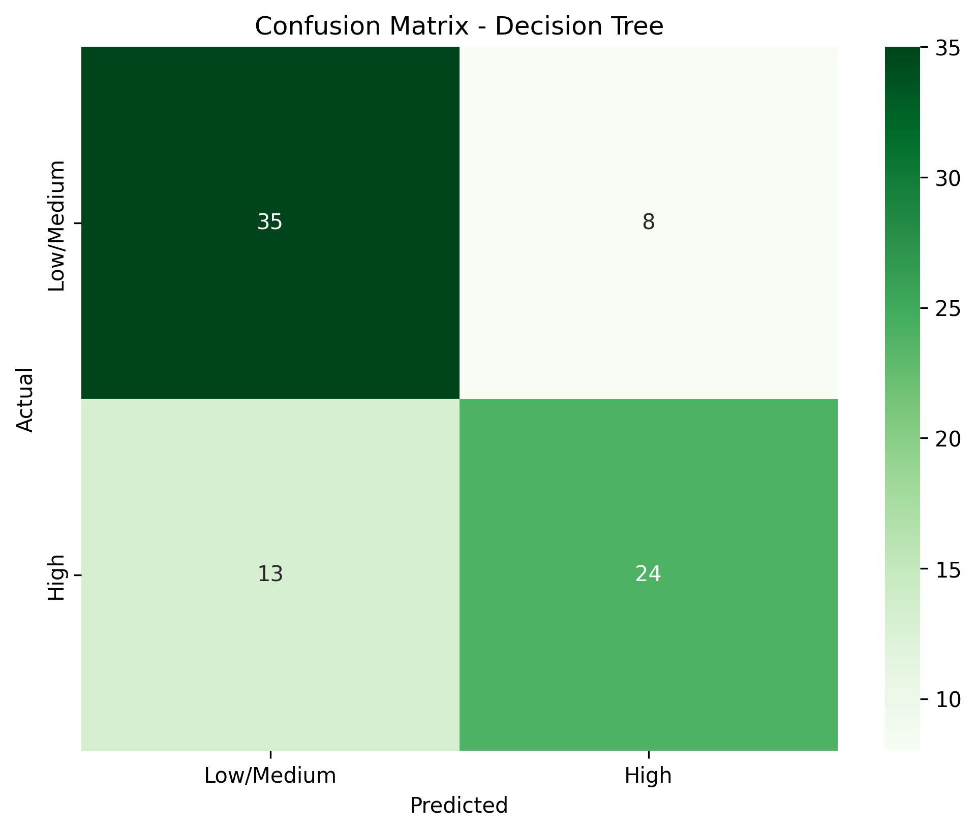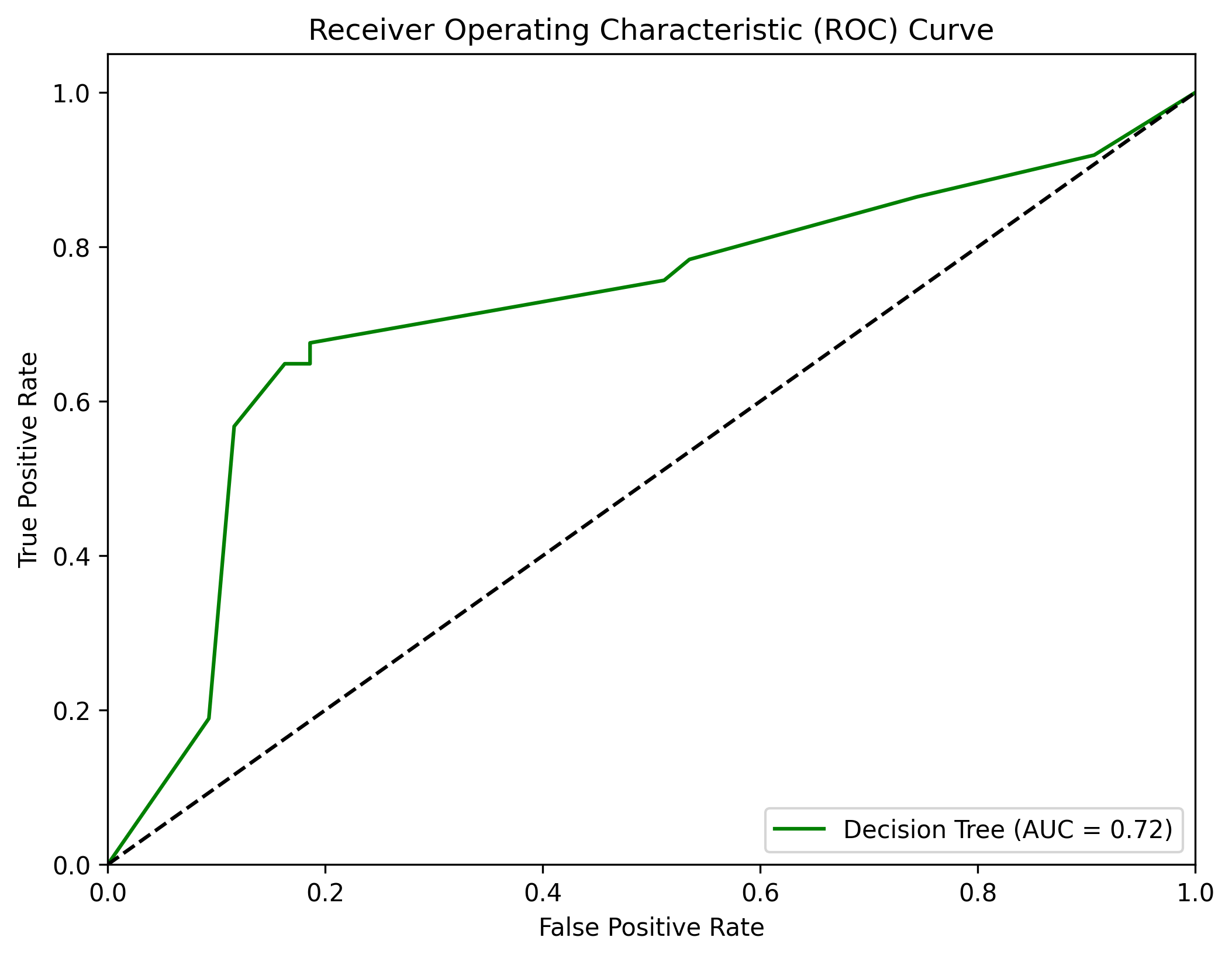
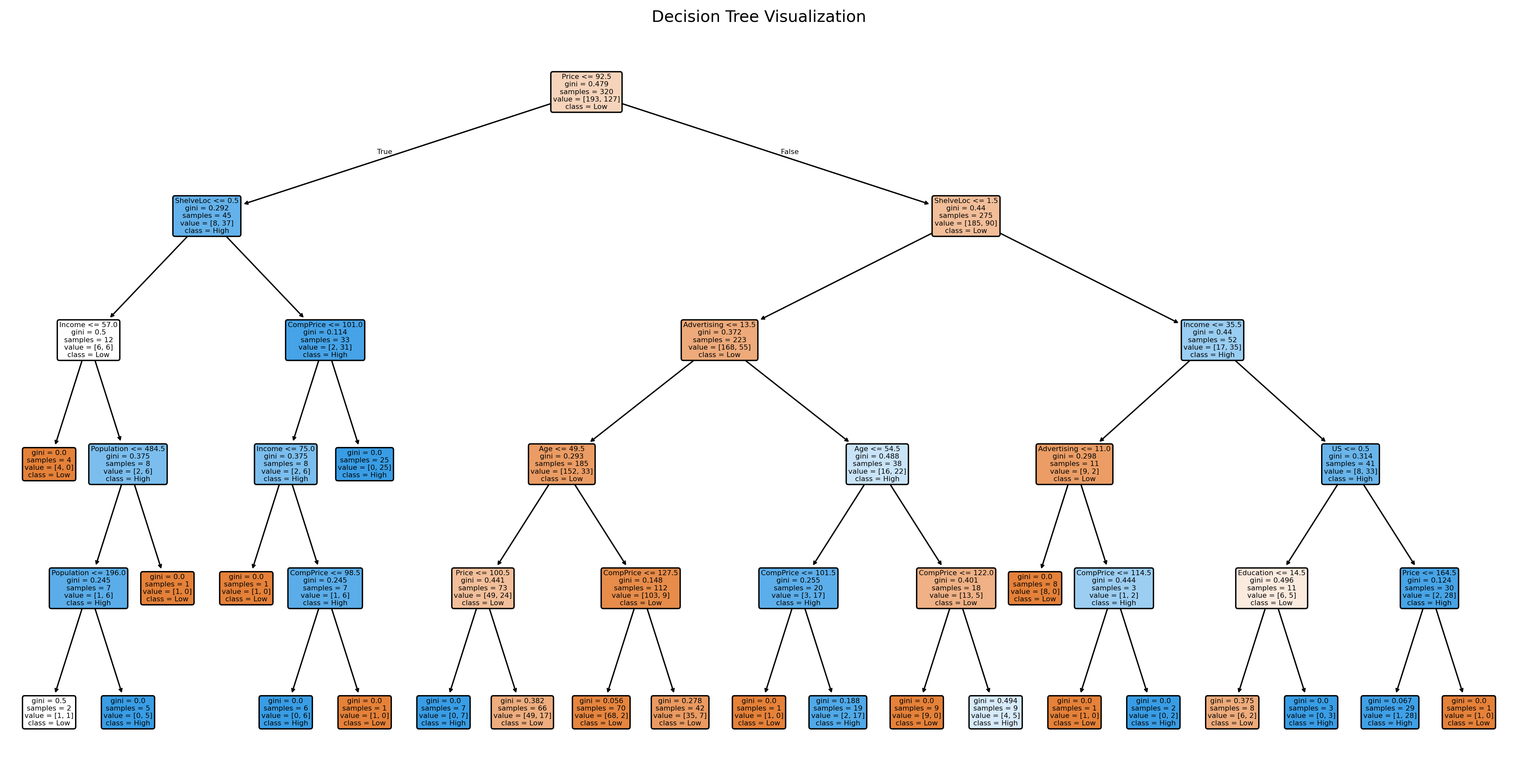
# Plot Decision Tree
plt.figure(figsize=(20, 10))
plot_tree(model, feature_names=X.columns, class_names=['Low', 'High'], filled=True, rounded=True)
plt.title('Decision Tree Visualization')
plt.savefig('dt_tree.png', dpi=300, bbox_inches='tight')
plt.show()