Linear Regression
This note will delve into the fundamentals of linear regression, a crucial technique in predictive modeling. Our
primary
focus will be on applying linear regression models using the
Dataset: California Housing
For this exercise, we will be using the California Housing dataset, a comprehensive dataset that includes various features of residential homes in California. This dataset is widely used for practicing and understanding regression models due to its rich and detailed attributes.
library(tidyverse)  # data wrangling

housing <- read.csv('../Datasets/housing.csv')
housing <- as_tibble(housing)

# loading the ames dataset
slice_head(housing, n = 10)glimpse(housing)dim(housing)names(housing)The housing dataset contains $10$ variables and $20650$ observations.
Exploring the California Housing Dataset
Our first step in exploring the dataset is to look at the dependent variable `median_house_value`. The goal is to understand its structure and use that information to inform the modeling process.
1. Distribution of the Median House Value
To begin, we will visualize the distribution of the `median_house_value`. This will help us understand the range, central tendency, and spread of the house values in the dataset. Visualizing the distribution can also reveal any potential skewness or outliers that might affect our regression model. We can use histograms or density plots to achieve this.
library(ggthemr)
ggthemr('fresh')

options(repr.plot.width = 12, repr.plot.height = 10)

# visualize the distribution of the median_house_value
ggplot( data = housing, aes(x = median_house_value) ) +
    geom_histogram(  col = 'black', binwidth = 5000) +
labs(title = "Distribution of Median House Value", x = "Median House Value", y = "Frequency") 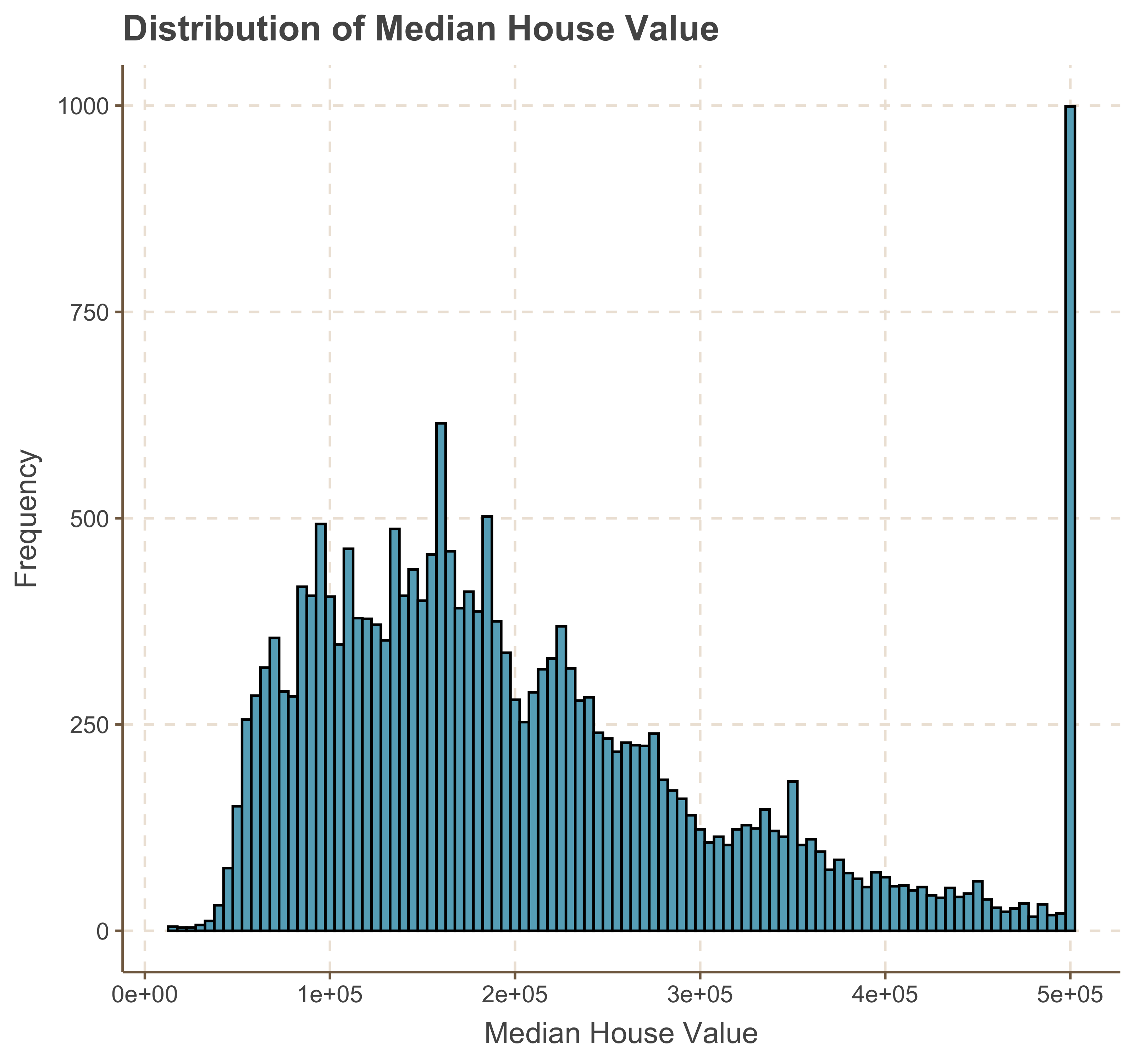
ggplot( data = housing, aes(x = median_house_value) ) +
    geom_histogram( bins = 40, col = 'black') +
    ggtitle('Distribution of log_10(Median House Value)') + scale_x_log10()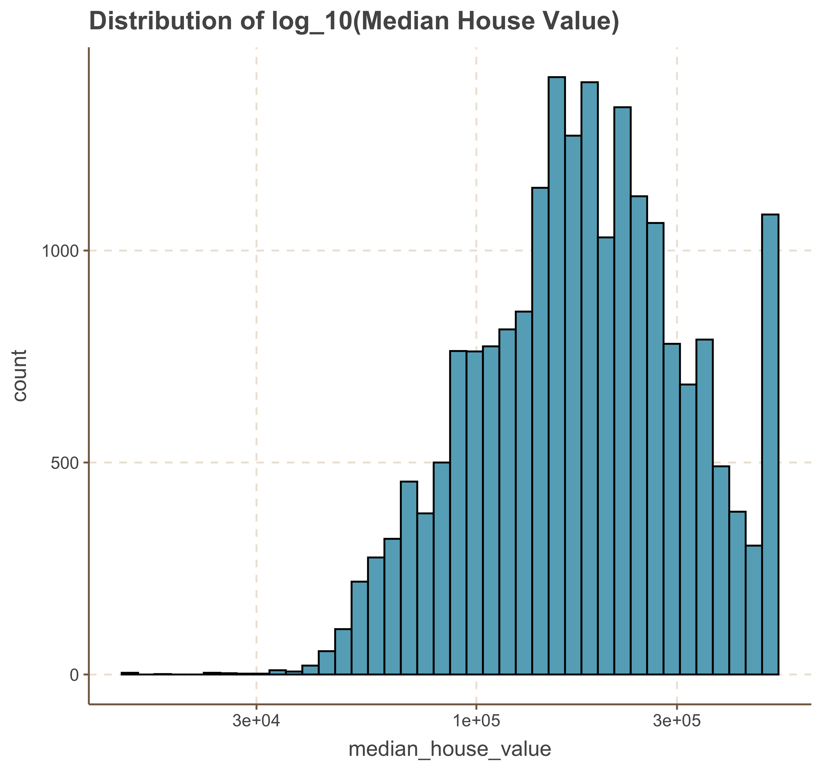
We notice that the log transformation has shifted the distribution to a left-skewed distribution. A choice can be made between using the original values or the log-transformed values, with an understanding of the impact this decision will have on model performance and interpretation.
Exploring Dependent Variable against a Sample of Numerical Variables.
There are a number of features that we can use to predict the
ggplot(data = housing, aes( x = longitude, y = latitude, color = median_house_value)) +
    geom_point( size = 2.5, alpha = .4 ) +
    scale_color_viridis_c() +
    ggtitle('Relationship between Latitude and Longitude by Median House Price')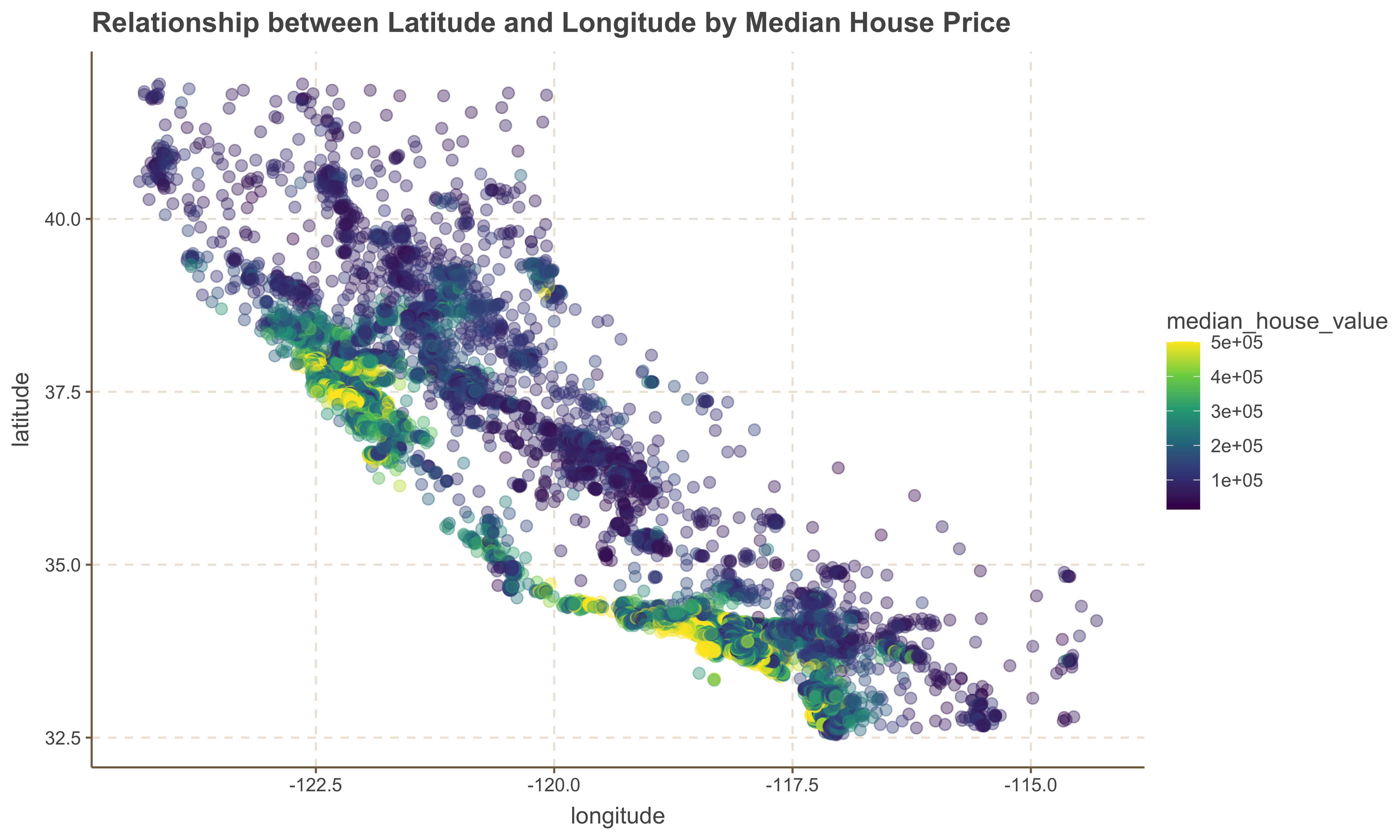
General Observerations
1. One useful observation is that the `median_house_value` tends to be higher for homes located on the left side of the `latitude` and `longitude` coordinates, which correspond to the coastal area. This suggests that `ocean_proximity` is an important factor in determining house values.
2. However, it is important to note that not all houses near the coast are more expensive than those further inland. Therefore, we should consider additional factors in our analysis to gain a more comprehensive understanding of house prices.
Relationship Between Population and Median House Value
Now we look at the relationship between Population and Median House Value to determine whether high or low density population determine the value of a home.
ggplot(housing, aes( x = population, y = median_house_value, color = median_house_value )) +
    geom_point(size = 2.5, alpha = .4 ) +
    scale_color_viridis_c() +
    ggtitle('Relationship between Population and Median House Price')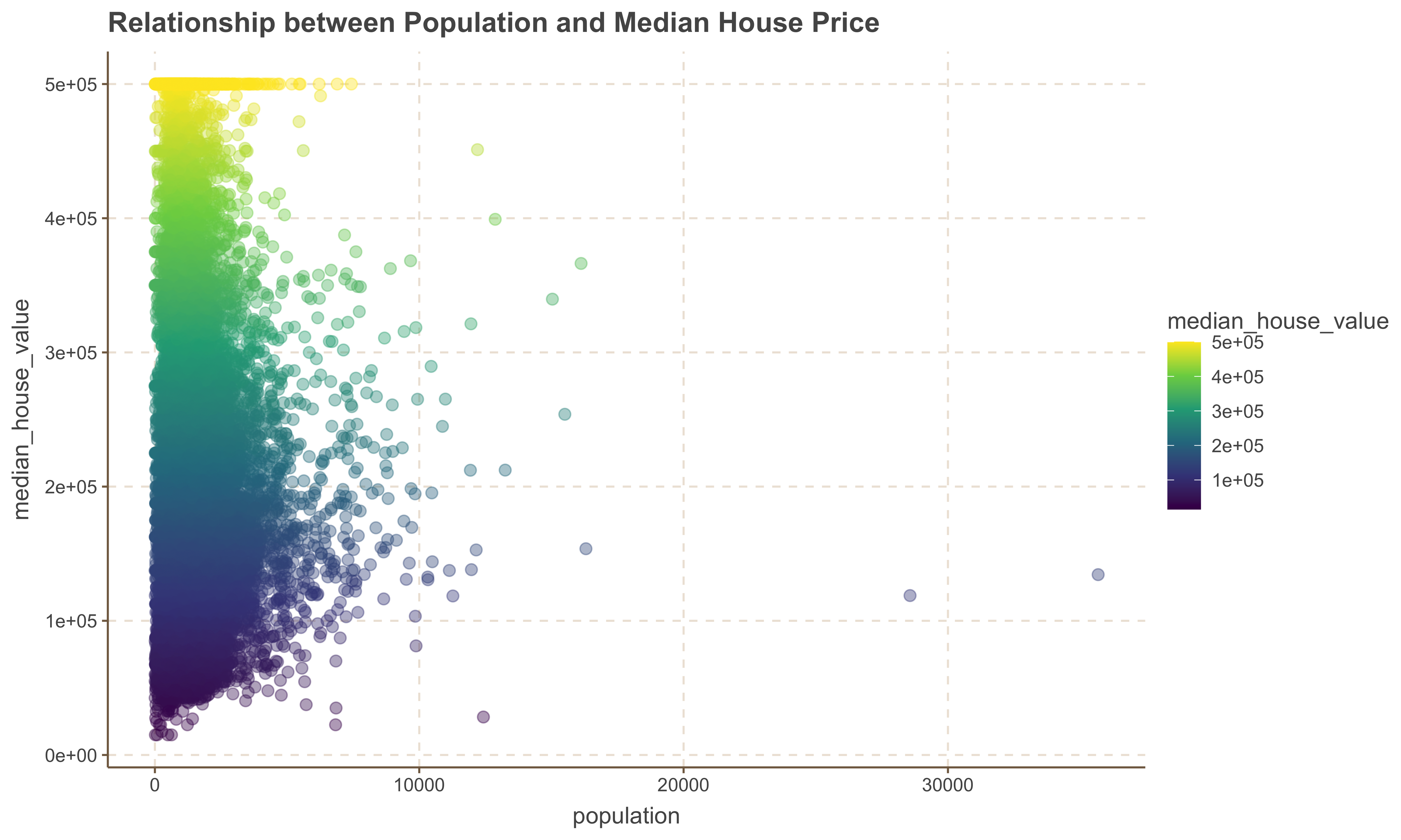
General Observation
1. There is no obvious relationship between the population of an area with the median_house_value variable.
2. We also observe a few outlier points with significant high population numbers.
Relationship Between Median Income and Median House Value
Now we look at the relationship between Median Income and Median House Value to determine whether the value of a home increases with a rise in median income.
ggplot(housing, aes(x = median_income, y = median_house_value, color = median_house_value)) +
    geom_point(alpha = 2) +
    scale_color_viridis_c() +
    ggtitle('Median Income vs. Median House Value')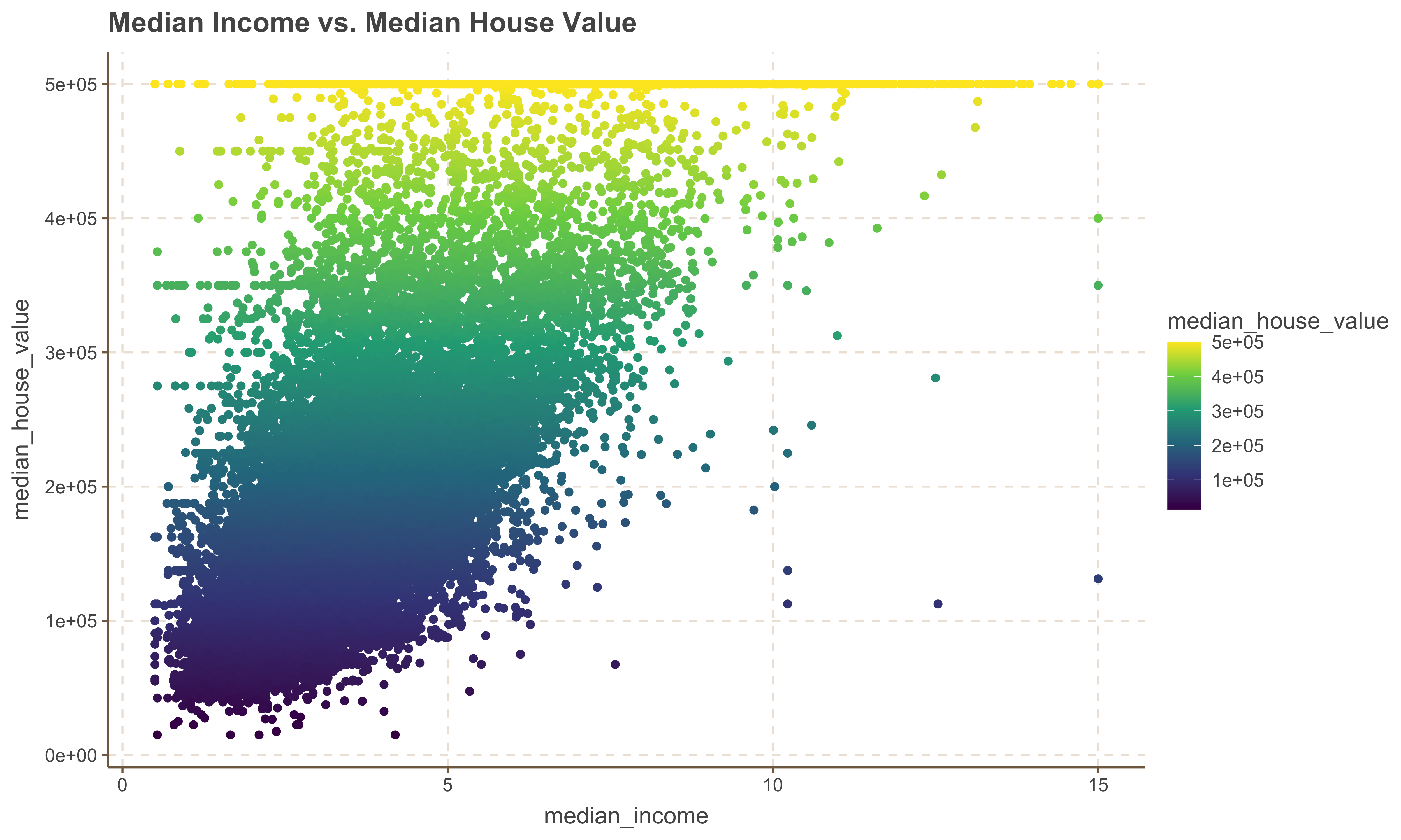
Implementing Simple Linear Regression
The mathematical formula for simple linear regression is:
$$ y = \beta_0 + \beta_1 x + \epsilon $$
Where:
- $y$ is the dependent variable (response),
- $x$ is the independent variable (predictor),
- $\beta_0$ is the y-intercept of the regression line,
- $\beta_1$ is the slope of the regression line, representing the change in $y$ for a one-unit change in $x$,
- $\epsilon$ is the error term, accounting for the variation in $y$ that cannot be explained by the linear
relationship with $x$.
In this section, we will build a simple linear regression model using the California Housing dataset. We will explore how the `tidymodels` and `tidyverse` packages in R can be used to fit the model, evaluate its performance, and interpret the results. Our primary focus will be on predicting the `median_house_value` using relevant predictor variables from the dataset.
Building a Model with tidymodels
To develop a model, we will use the
The
1. Specify the model: Define the type of model you want to build, such as regression or classification.
2. Specify the engine: Choose the function or algorithm to use for modeling, such as `lm` for linear regression or `glm` for generalized linear models.
3. Fit the model and estimate parameters: Apply the model to your data and estimate the parameters based on the specified engine.
Let's demonstrate how this works
library(tidymodels)Splitting the Data into Train and Test
A fundamental aspect of statistical modeling is the process of splitting your data into training and testing sets. This allows you to build and validate your model effectively. The training set is used to fit the model, while the testing set is used to evaluate its performance on unseen data. This helps in assessing the model’s generalizability and ensures that it performs well on new data.
Splitting the data into train and test sets involves the following steps:
__Set a Seed for Reproducibility__: Setting a seed ensures that the split is reproducible.
__Use an Initial Split__: Create an initial split of the data, typically into 80% training and 20% testing sets.
__Extract Training and Testing Data__: Separate the data into training and testing sets based on the initial
split.
Here is how you can implement this using the tidymodels framework:
# Split the data into training and testing sets
set.seed(503)  # For reproducibility
data_split <- initial_split(housing, prop = 0.8)

# extract training and testing data
train_data <- training(data_split)
test_data <- testing(data_split)
Defining Linear Regression Model with tidymodels
As noted earlier, Defining a linear regression model using the tidymodels framework involves a few systematic steps. Below is the demonstrate of implementing these steps separated and then collectively
# Specifying the model
linear_reg()Specifying the Engine
linear_reg() %>% set_engine("lm") # uses lm: linear modelFitting the SLR model
To fit the model with a specified model and engine, we simply add the fit method to the sequence of model and engine. The model below fits a linear regression of the form:
$$ median\ house \ value = \beta_0 + \beta_1 * median \ income + \epsilon $$
linear_reg() %>%
   set_engine("lm") %>%
fit(median_house_value ~ median_income, data = train_data)We can now see the outcome of the training model with the coefficients and model object presented.
slr_model <- linear_reg() %>%
    set_engine("lm") %>%
fit(median_house_value ~ median_income, data = train_data)Summary of the Model
We can also retrieve the model's summary by plucking the `fit` and piping it to a summary object as shown below.
slr_model %>% pluck('fit') %>% summary()Model Statistics
Another useful function is the glance function which can extract model statistics.
glance(slr_model)Augmenting Model Fit
Another important function within the
train_aug <- augment(slr_model$fit)
train_aug %>% head()Visualizing the Model
One of the ways to visualize our model is to plot the regression line against the observation data. This helps in understanding how well the model fits the data and in identifying any deviations or patterns that the model might not have captured.
ggplot(train_aug, aes(x = median_income, y = median_house_value)) +
    # scatterplot points
    geom_point(alpha = 0.5) +
    # Passing the coefficients to the the geom line
    geom_abline(slope = 41823.8, intercept = 45185.7, color = 'red', linewidth = 1.09) +
    labs(title = "Predicted vs Actual Values (Training Data)", x = "Predicted Values", y = "Actual Values")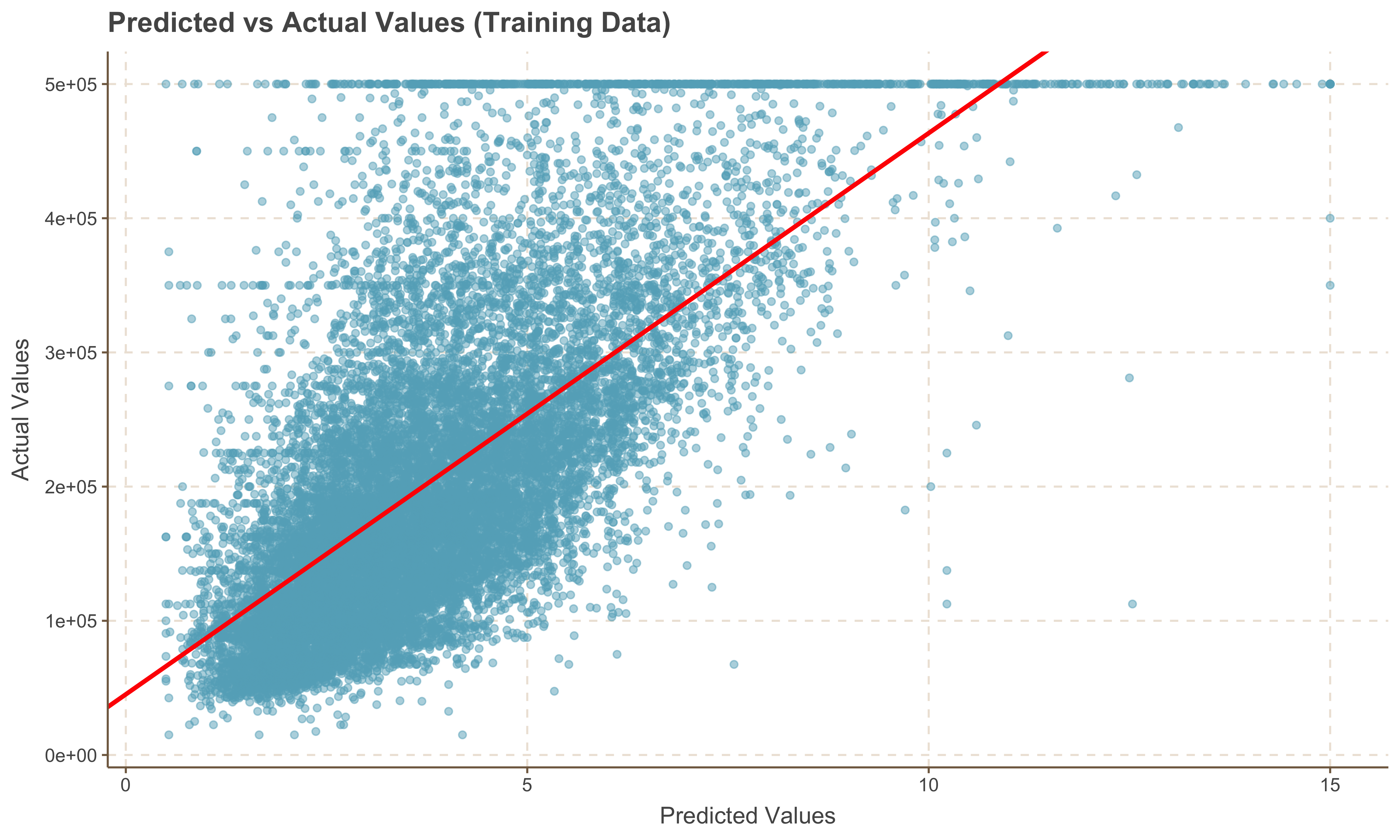
Predicting Values on the Test Set
Now that we have a model generated, we can run predictions on the test set. We utilize the
test_predictions <- predict(slr_model, new_data = test_data)
slice_head(test_predictions, n = 10)