Logistic Regression
Logistic regression is a statistical method used for binary classification problems, where the outcome variable has two possible categories. Unlike linear regression which predicts continuous values, logistic regression estimates the probability that an observation belongs to a particular class. It uses the logistic function to transform linear combinations of input features into probabilities between 0 and 1, making it particularly useful for predicting outcomes such as yes/no, pass/fail, or default/no default scenarios in financial modeling.
Logistic Regression - Mathematical Formulation
Logistic regression is used to model the probability of a binary outcome based on one or more predictor variables. We will use the Default dataset from the ISLR package to demonstrate this process.
Recall that the model takes the form:
$$p(y = Default | X) = \beta_0 + \beta_1X$$
With the logistic function, it can be written as:
$$ p(Y) = \frac {e^{\beta_0 + \beta_1 X}} {1 + e^{\beta_0 + \beta_1 X} } $$
The Dataset
For this task, we will use the Default dataset from the ISLR (Introduction to Statistical Learning with R) book. This dataset contains information on whether an individual defaults on their credit card payment along with predictors such as income, balance, and student status. It is an excellent example for practicing logistic regression.
Metadata
default: Indicates whether the individual defaulted on their credit card payment, (Yes, No)
student: Indicates whether the individual is a student. (Yes, No)
balance: The balance on the individual's credit card.
income: The individual's annual income.
Importing the Dataset
There are a few options to import the dataset. You may use the .csv file. Below we use the latter option.
# Loading the necessary packages
library(tidyverse)
library(tidymodels)

credit_data <- read.csv('Datasets/Default.csv')
credit_data <- as_tibble(credit_data) %>% rename(default='X...default')

slice_head(credit_data, n = 8)| default | student | balance | income |
|---|---|---|---|
| <chr> | <chr> | <dbl> | <dbl> |
| No | No | 729.5265 | 44361.625 |
| No | Yes | 817.1804 | 12106.135 |
| No | No | 1073.549 | 31767.139 |
| No | No | 529.2506 | 35704.494 |
| No | No | 785.6559 | 38463.496 |
| No | Yes | 919.5885 | 7491.559 |
| No | No | 825.5133 | 24905.227 |
| No | Yes | 808.6675 | 17600.451 |
dim(credit_data)Let's begin by recreating some of the charts for the ISLR book. This is meant to provide additional practice and some thinking around what features are more useful.
library(ggthemr)
library(ggplot2)

# setting the them for visualization
ggthemr('flat')

# setting plot dimensions
options( repr.plot.width = 12, repr.plot.height = 8 )
ggplot(data = credit_data, aes(x = balance, y = income, color = factor(default))) +
    geom_point() +
    ggtitle('Scatter Plot of Income vs Balance by Default Status')
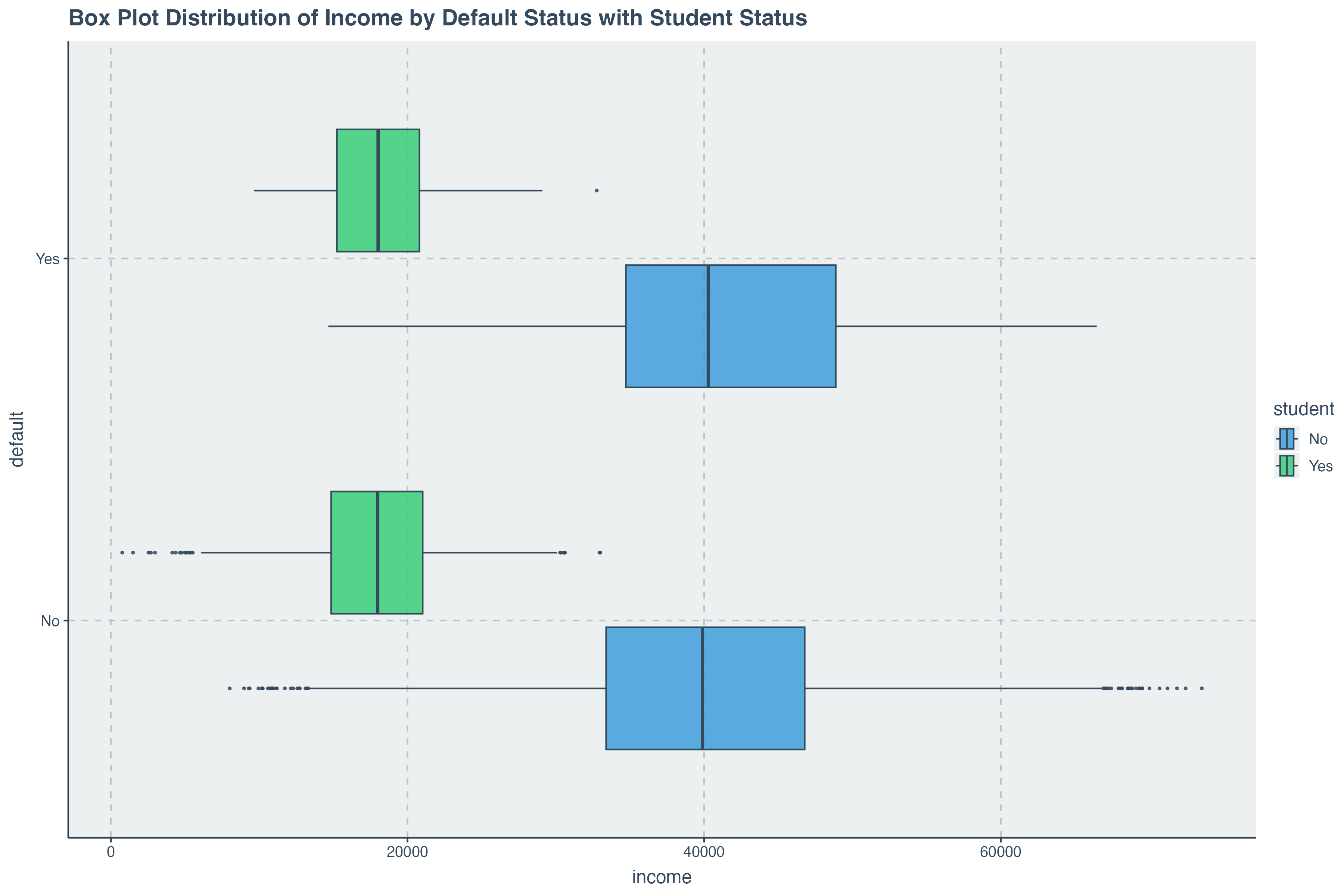
ggplot( data = credit_data, aes(x = balance, y= default,fill = student) ) +
        geom_boxplot( alpha = .8) +
        ggtitle('Box Plot Distribution of Balance vs Default by Student Status')
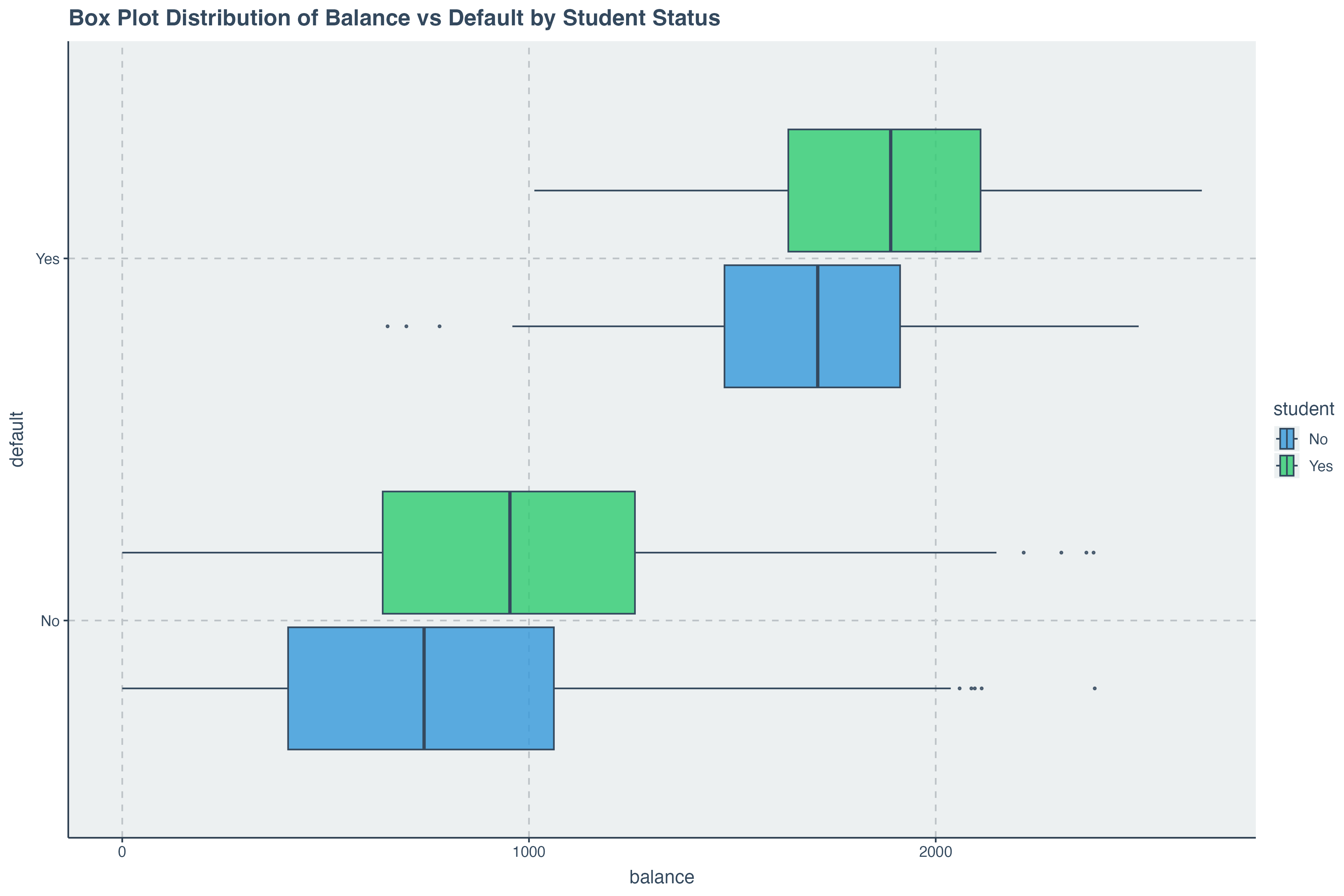
We can begin get an indication that
Data Preparation for Modelling
In the previous discussions, we have learned about splitting the dataset ahead of a modeling task. This section
covers the preparation we need. Before we split the data, we must convert the
Changing Categorical Variables into Factors
# changing categorical variables into factors
credit_data <- credit_data %>%
                mutate( default = as.factor(default),
                        student = as.factor(default))

credit_data %>% head()| default | student | balance | income | |
|---|---|---|---|---|
| 1 | No | No | 729.5265 | 44361.625 |
| 2 | No | No | 817.1804 | 12106.135 |
| 3 | No | No | 1073.5492 | 31767.139 |
| 4 | No | No | 529.2506 | 35704.494 |
| 5 | No | No | 785.6559 | 38463.496 |
| 6 | No | No | 919.5885 | 7491.559 |
Splitting the dataset into Train and Test
We can now go ahead and split the data into train and test groups.
# for reproducibility
set.seed(514)

# setting the split model
data_split = initial_split( credit_data, prop = .8, strata = 'default' )

# splitting the dataset
train_data = training(data_split)
test_data = testing(data_split)
Building the Logistic Regression Model
On this section, we will build a logistic regression model using the
Recall that the model takes the form:
$$p(y = Default | X) = \beta_0 + \beta_1X$$
With the logistic function, it can be written as:
$$ p(Y) = \frac {e^{\beta_0 + \beta_1 X}} {1 + e^{\beta_0 + \beta_1 X} } $$
Now let's see the implementation of this with
# Specify a logistic regression model
logistic_model <- logistic_reg() %>%
                   # Set the engine to "glm" which uses the generalized linear model function in R
                   set_engine("glm") %>%
                   # Set the mode to "classification" since logistic regression is used for binary outcomes
                   set_mode("classification")
Describing the and Fitting the Model
Our model itself is of the form:
$$ p(x) = \beta_0 + \beta_1 Income + \beta_2 balance $$
Let's run a fit on our model and display the model parameters we have received.
model <- logistic_model %>%
           fit( data = train_data, formula = default ~ income + balance )

tidy(model)The
Model Parameter Output
We have already seen how to get the model parameters output in tidy format. A useful detail to add here is that
we can also retrive the summary of the model which is built into the
model %>% pluck("fit") %>% summary()Making Predictions with the Trained Model
With our logistic regression model trained, we can now make predictions on the test dataset. It is important to compare the predicted results with our intuition and the actual outcomes to evaluate the model’s performance. The following code snippet demonstrates how to predict the default status of individuals based on their balance and income using the trained model.
We notice that the predictions are already converted into the final factor outcome. This is certainly useful, however, it is important to note that these predictions are converted from probabilities. To get the probabilities, we can run the following code:
predict( model, new_data = test_data, type = 'prob' ) %>% head()Now we see that for each prediction, there is a probability associated with the factor value
Assessing Model Accuracy
Just like with linear regression, it is crucial to assess the accuracy and performance of our logistic regression model. This helps us understand how well our model is performing and whether it is making accurate predictions. The following steps demonstrate how to evaluate the accuracy of the logistic regression model using various metrics.
augment for combining predictions with test data
The code below then uses the augment function which combines the new_data and predictions of a model into a single tibble object.
augment( model, new_data = test_data ) %>% head()
conf_mat returns to us the confusion matrix
We can then pass these directly into a confusion matrix. The confusion matrix gives us a view of what the correct predictions where and the incorrect predictions were as well.
augment( model, new_data = test_data ) %>%
conf_mat( truth = default, estimate = .pred_class )Turning Confunsion Matrix into a Visual
If we wish to do so, we can also that the confusion matrix into a plot directly within the code above by passing
the
augment( model, new_data = test_data ) %>%
         conf_mat( truth = default, estimate = .pred_class  ) %>%
         autoplot( type = 'heatmap') +
         ggtitle("Confusion Matrix for Logistic Regression Model")
Computing Accuracy Metric
In addition to generating a confusion matrix, we can directly compute the accuracy of our logistic regression model using the accuracy function. Accuracy is a key metric that indicates the proportion of correct predictions made by the model out of all predictions. The following code snippet demonstrates how to compute the accuracy of the model.
augment( model, new_data = test_data ) %>%
accuracy( truth = default, estimate = .pred_class ) This multiple logistic regression model with two features is very accurate with a test data accuracy of $97.7%$.
Additional Model Assessment Metrics
While accuracy is a useful metric to understand how well the model is performing, it is not always sufficient, especially when dealing with imbalanced datasets. Other metrics such as sensitivity (recall), specificity, precision, and the F1-score provide a more comprehensive view of the model’s performance. Below, we calculate these additional metrics for our logistic regression model.
augment( model, new_data = test_data ) %>%
    summarise(
               accuracy = mean( .pred_class == default),
               sensitivity = sens_vec(truth = default, estimate = .pred_class),
               specificity = spec_vec(truth = default, estimate = .pred_class),
               precision = precision_vec(truth = default, estimate = .pred_class),
               recall = recall_vec(truth = default, estimate = .pred_class),
               f1 = f_meas_vec(truth = default, estimate = .pred_class)
            )
Turning Confunsion Matrix into a Visual
If we wish to do so, we can also that the confusion matrix into a plot directly within the code above by passing
the
augment( model, new_data = test_data ) %>%
         conf_mat( truth = default, estimate = .pred_class  ) %>%
         autoplot( type = 'heatmap') +
         ggtitle("Confusion Matrix for Logistic Regression Model")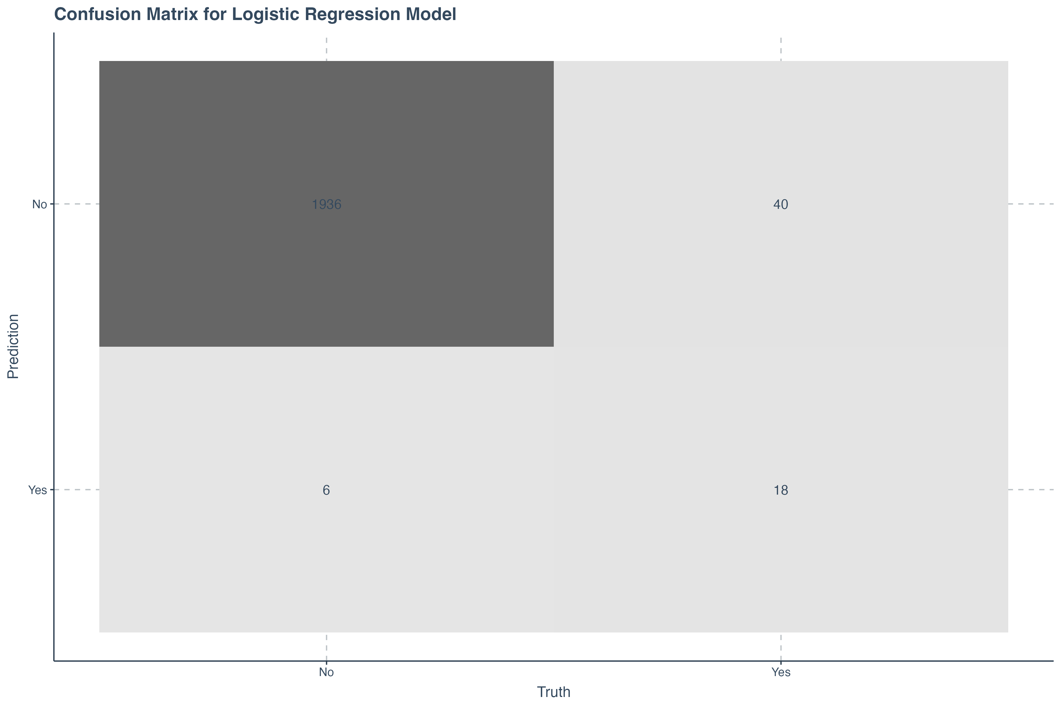
ROC Curve
The Receiver Operating Characteristic (ROC) curve is a graphical representation of a classifier’s performance. It plots the True Positive Rate (Sensitivity) against the False Positive Rate (1 - Specificity) at various threshold settings. The Area Under the ROC Curve (AUC) is a single scalar value that summarizes the performance of the classifier across all thresholds.
Below is a demostration demonstrate how to generate and interpret the ROC curve for our logistic regression model.
augment( model, new_data = test_data ) %>%
    # set probabilities for the "No" class
    roc_curve(truth = default, .pred_No) %>%
    autoplot() +
    ggtitle("ROC Curve for Model Performance") + theme_minimal()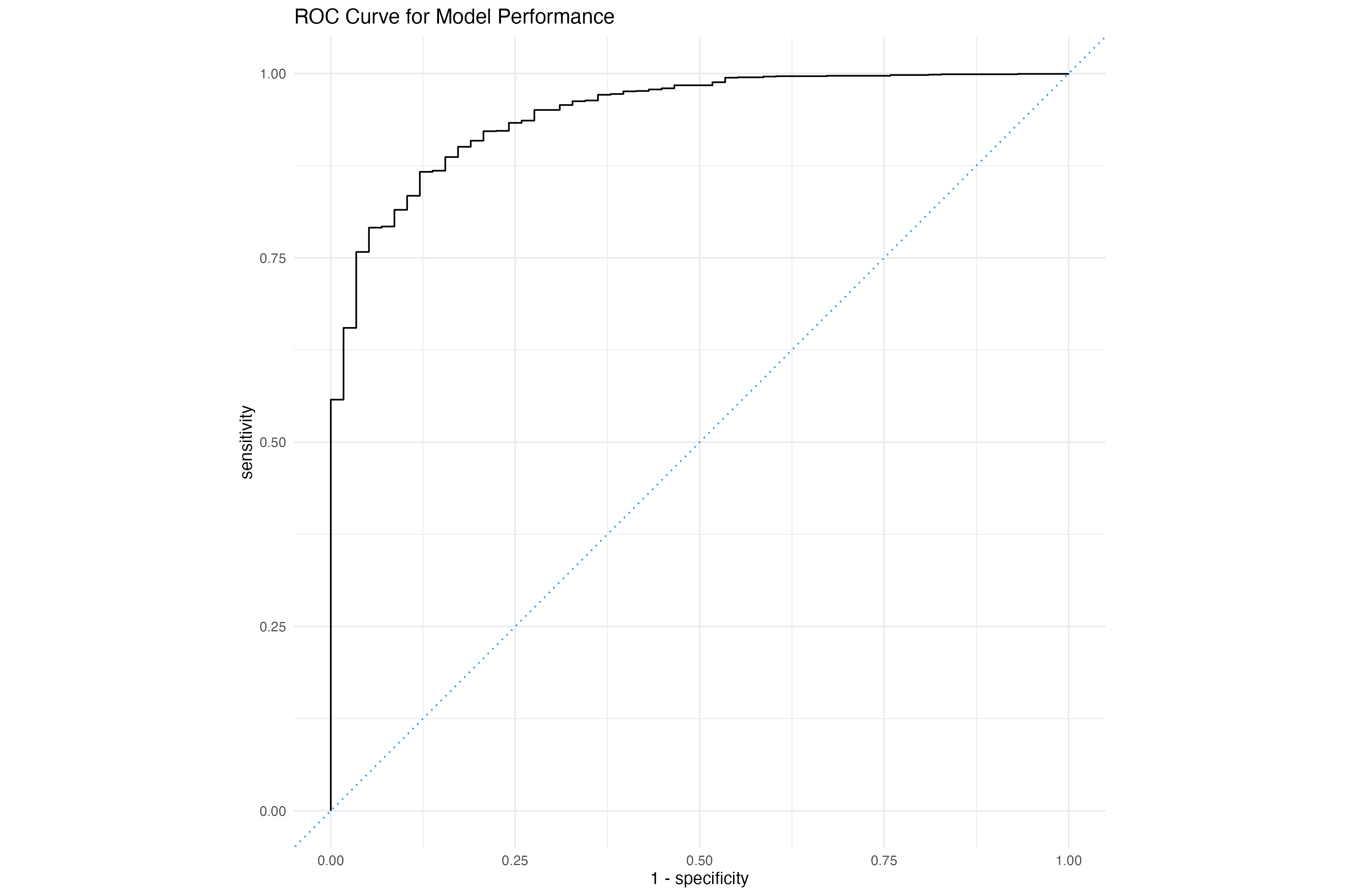
# Calculate AUC
augmented_data <- augment( model, new_data = test_data )
auc_result <- roc_auc(augmented_data, truth = default, .pred_No)

# Display the AUC
print(auc_result)Key Takeaways from the ROC Curve:
- Accuracy: The area under the ROC curve (AUC-ROC) represents the model's overall accuracy. An AUC-ROC of 1 represents a perfect classifier, while an AUC-ROC of 0.5 represents a random classifier.
- True Positives and False Positives: The curve shows the relationship between true positives (correctly classified instances) and false positives (incorrectly classified instances) at different thresholds.
- Threshold Selection: The ROC curve helps in selecting the optimal threshold for the model, which balances the true positive rate and false positive rate.
- Model Comparison: ROC curves can be used to compare the performance of different models, with higher AUC-ROC values indicating better performance.
Interpreting the ROC Curve:
A curve closer to the top-left corner indicates better performance, as it represents a higher true positive rate and a lower false positive rate.
A curve closer to the diagonal line indicates random performance, as it represents an equal true positive rate and false positive rate.