Column Charts
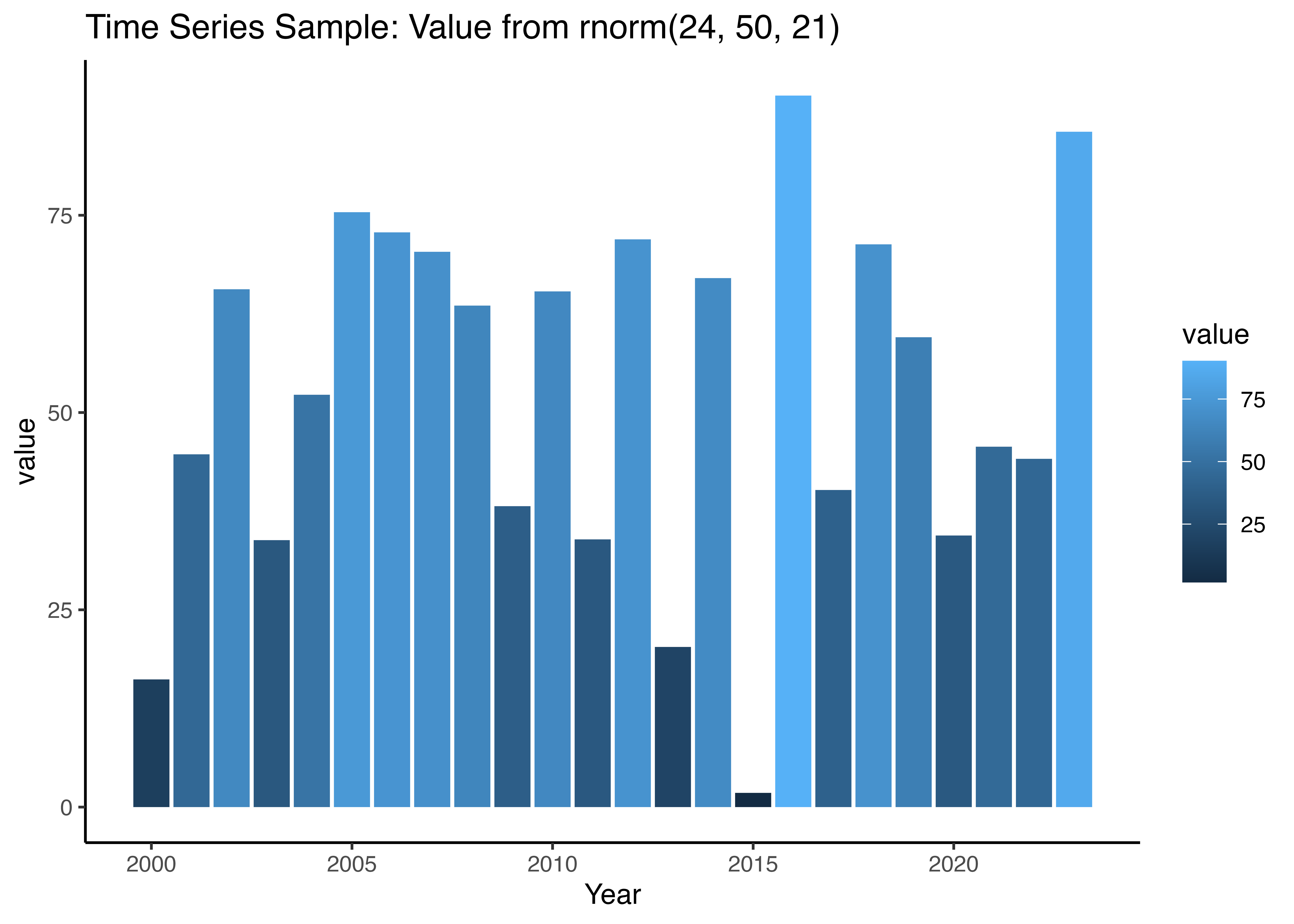
Column charts are fantastic at showcasing one or more categories of items over time. In contrast to the line or time series plot, they excel at offering a clearer visual of variable changes through fill intensity. In the example below, I showcase the implementation of a column plot, leveraging the random normal distribution across a 24-interval period.
library(ggplot2)
library(ggthemes)

data = data.frame( Year = seq(2000, 2023, length.out = 24),
                   value = rnorm( n = 24, mean = 50, sd = 21 ))

head(data)| Year | value | |
|---|---|---|
| 1 | 2000 | 16.17888 |
| 2 | 2001 | 44.70431 |
| 3 | 2002 | 65.62167 |
| 4 | 2003 | 33.82868 |
| 5 | 2004 | 52.25220 |
| 6 | 2005 | 75.38828 |
Implementation of Column Chart with geom_col()
Using the fill
column_chart = ggplot( data = data, aes( x = Year, y = value, fill=value ) ) +
               geom_col() +
               ggtitle("Time Series Sample: Value from rnorm(24, 50, 21)") +
               theme_classic()

column_chart